Designing the session scheduling web experience
TutorComp · Responsive web app · 2022
MY ROLE
UX Lead - User research, UI design, Interaction design, Usability testing
TEAM
Product Manager, 4 Engineers, 2 Testers
MODEL
B2C
TIMELINE & STATUS
12 weeks, Launched in Feb 2022
OVERVIEW
TutorComp is an online tutoring platform that offers personalized online tutoring services to students worldwide. The company provides one-on-one tutoring services to students of all ages and levels, from kindergarten to college, covering a wide range of subjects and curricula.
HIGHLIGHTS
We have introduced self-scheduling, a new feature on the TutorComp website that allows online learners to independently book tutoring sessions according to their availability and preferences.
1.0 Self-scheduling feature highlights
IMPACT
During the four months following its launch, the self-scheduling feature logged:
CONTEXT
The pandemic and some online lessons.
The surge in online learning options since the COVID-19 outbreak.
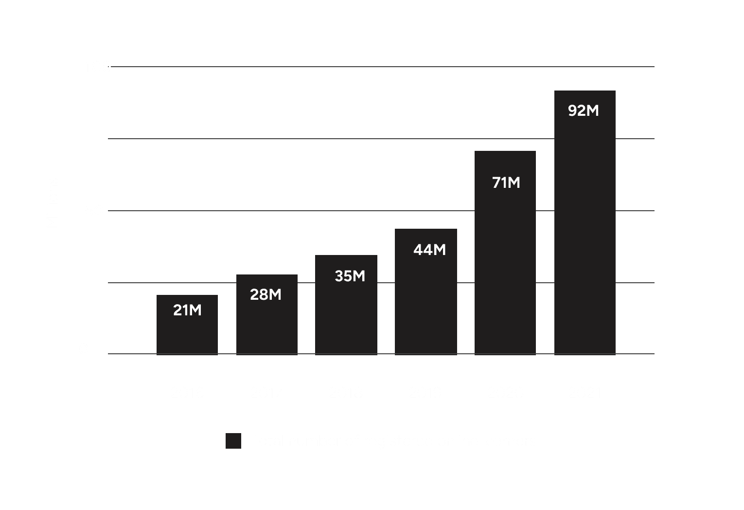
Severe restrictions due to the onset of COVID-19 have significantly impacted the education sector, particularly classroom tutoring. As a result, there has been an upward trend in the number of online learners since the pandemic began.
3.0 More than 20 million new learners registered for courses in 2021, Source: Coursera
Leveraging the opportunity and addressing existing problems.
With an increasing number of learners choosing online education, TutorComp needed to enhance its user experience to retain its loyal learner base while simultaneously attracting new students, especially given the growth in the online learning industry.
Upon reviewing user feedback, it became evident that the session scheduling process had significant friction, resulting in learner drop-offs. In the current post-pandemic competitive market, providing a smooth and effective online learning experience is crucial for the growth and sustainability of the business.
Session scheduling is at the centre of the TutorComp learning experience.
Apart from hosting world-class tutors on the platform, it is crucial to provide effective and user-friendly tools that efficiently match learners with the most suitable tutors.
PROBLEM
Cracking down on session scheduling.
The session scheduling process was inefficient and cumbersome.
The key steps in the session scheduling process were:
Contacting the academic advisor
As a first step, the advisor should be contacted each time a session is scheduled.
Advisor looking up for a suitable tutor
An assigned advisor searches for a suitable tutor based on the student's preferences and availability, examining matching tutor profiles.
Scheduling the session
The advisor will present the student with suitable options for the session. The user can then confirm their choice to finalize the booking.
The call for user research.
Understanding the current scheduling process is essential for improving the overall experience. Therefore, it is important to break down the process and identify its key issues.
User research for thorough understanding
18 people were interviewed.
User interviews were conducted with 12 existing learners and 6 academic advisors.
The key findings from the research were:
Learners often encounter difficulties in accessing tutors’ availability and pertinent information about them. This lack of transparency makes it challenging for learners to find suitable time slots and make informed decisions before booking a session.
The rigid scheduling process does not allow for the booking of consecutive sessions in a single transaction.
A student persona was created to serve as a compass for product development.
One persona was created based on user interviews to ensure that everyone is aligned as we work towards developing the best scheduling experience for learners.
4.0 The student persona
To establish a self-scheduling capability for TutorComp's online learners, empowering them to schedule sessions with tutors according to mutual availability. This capability will include flexible scheduling options and relevant tutor information, allowing learners to make informed decisions.
PROCESS
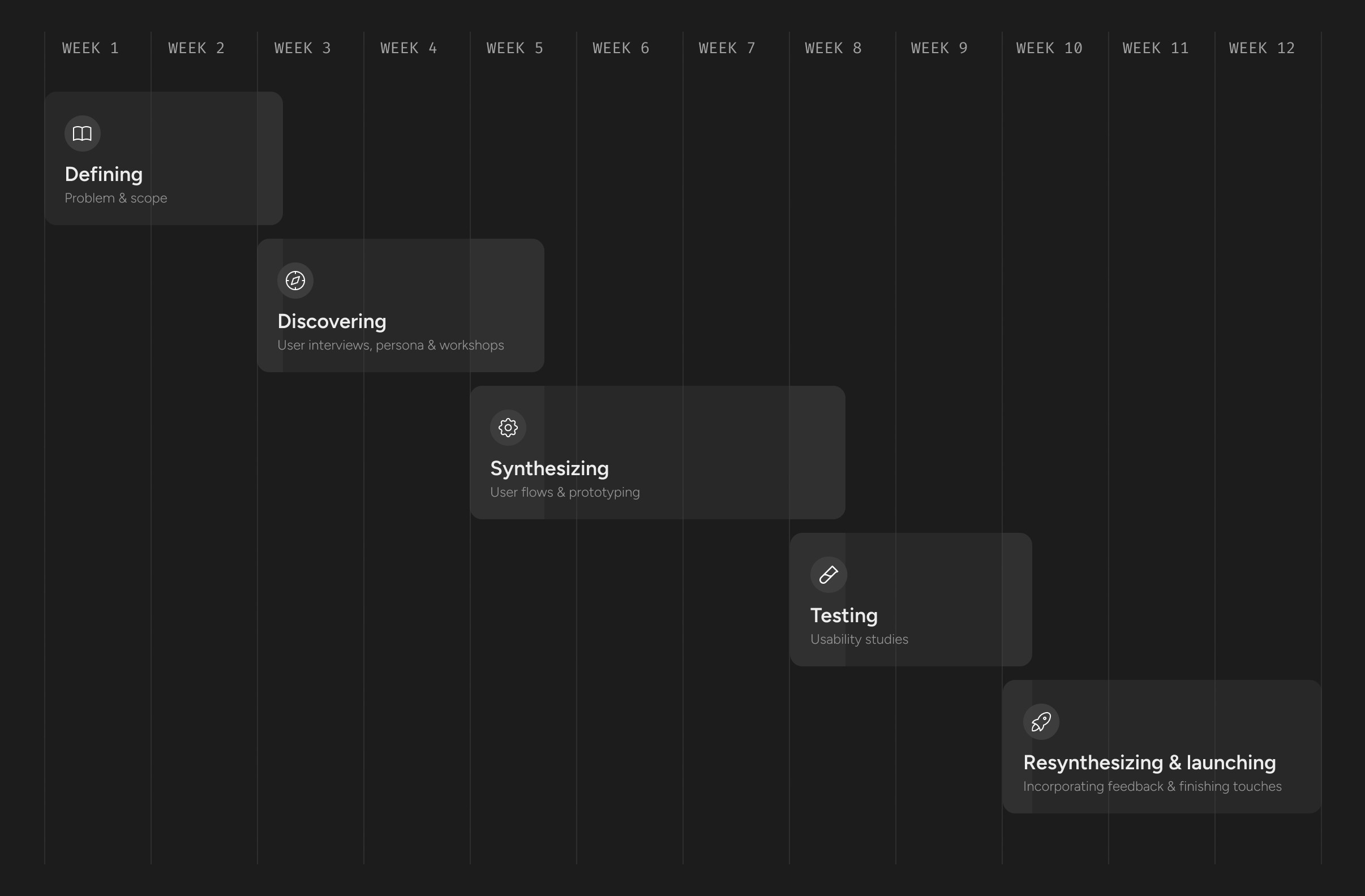
We created an outcome based process.
Cross collaboration was key.
Nearly all phases of the process involved members from management, the marketing team, engineers, and the academic support team, all of whom had a stake in developing an effective scheduling system.
5.0 The project timeline
DISCOVERY
Finding solutions and uncovering opportunities.
Workshops were organized.
The design team organized brainstorming workshops that involved all stakeholders. Following this, the design team and management convened to finalize practical and impactful ideas using a cost-impact matrix.
The three key ideas that received approval were:
Adding flexible options.
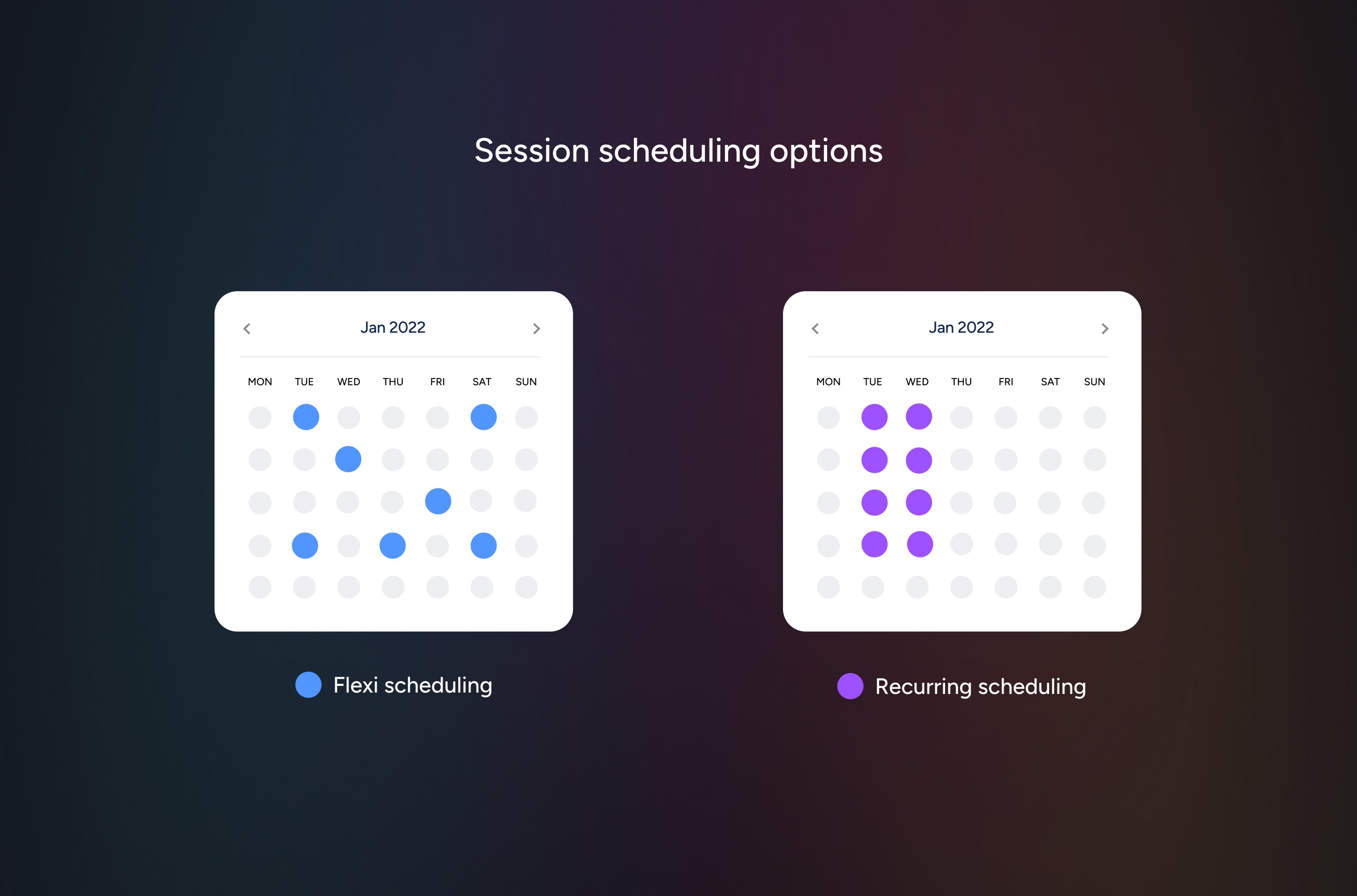
Introducing 'flexi' and 'recurring' scheduling options.
The "flexi scheduling" option allows students to book individual sessions based on the available time slots for a tutor. Meanwhile, the "recurring" option enables students to extend their selected slots for a particular week over a specified number of consecutive weeks with the same tutor (image 6.0).
6.0 The session scheduling options
Incorporating tutor profiles.
Enabling decision making.
Understanding a tutor’s details, such as their educational background, tutoring experience, and subject matter expertise, is crucial. This information helps students find the right tutor to meet their needs.
Focusing on user preferences.
Prioritizing learner convenience.
It is essential to accommodate various user preferences, such as session duration and preferred date and time, when scheduling. Learners should be provided with ample choices and options to effectively utilise their time according to their convenience.
INITIAL DESIGNS
Version 1.0
The self-scheduling user flow.
The flow (image 7.0) follows a wizard-style format, with significant branching occurring after the student selects the session type. Each session type presents a different set of sub-options for the student to choose from.
7.0 The user flow diagram
The recurring flow
The recurring flow (video loop 7.1) enables learners to choose their preferred day and time for each weekly session. After making their selections, they can pick a tutor and view the available time slots. Once they have chosen a available schedule, a corresponding timetable will be displayed in the right pane for clarity, ensuring a smooth and confident progression.
7.1 The recurring flow screens
The flexi flow
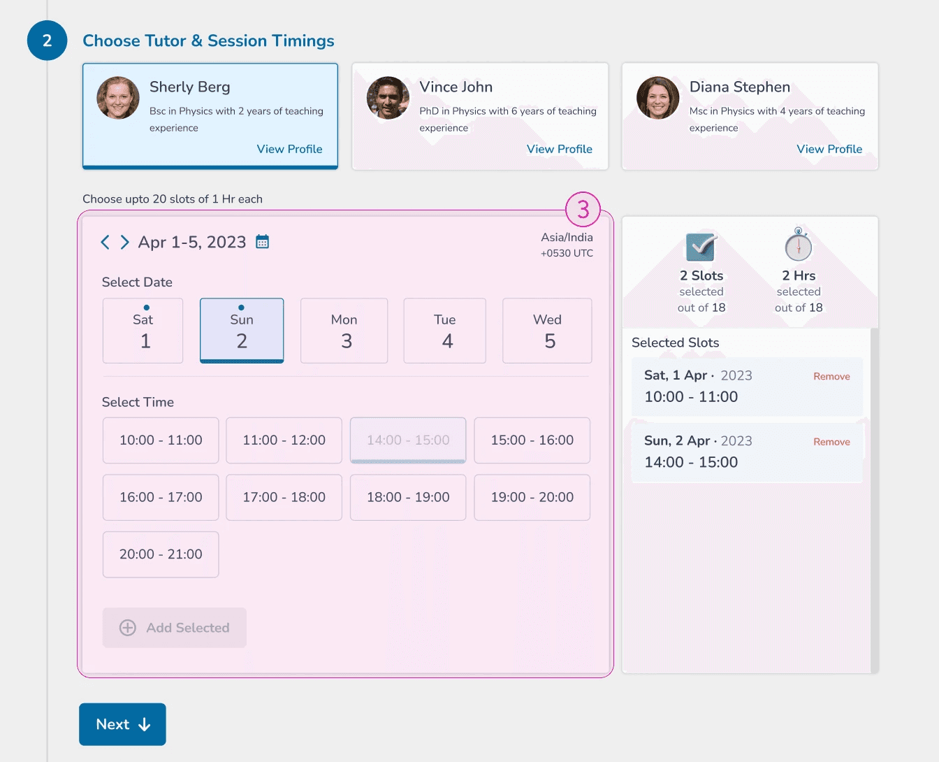
The Flexi Flow (Video Loop 7.2) is straightforward. The learner can choose a tutor, then select a date to view all available time slots for that day. After making a selection, they can add the chosen slot by clicking the 'Add Selected' button at the bottom. All selected slots, along with the remaining available hours, are displayed in the right pane, ensuring that the learner is always informed about their status and any changes made before confirming their choices.
7.2 The flexi flow screens
Tutor profile as popup.
The tutor profile (video loop 7.3) is designed as a popup in the tutor selection screen. This popup provides all essential information about the respective tutor without losing the scheduling context.
7.3 The tutor profile
USABILITY TESTING AND REVIEW
The initial designs were tested with potential users.
Twenty participants were recruited.
A total of 20 participants, mostly students, were recruited to test the initial designs.
We used four test scenarios.
Four different testing scenarios were assigned to a total of twenty random students during a remote usability test. The sessions were recorded for a detailed review to gather insights.
The key findings from the review were:
Session preferences confusion
Recurring flow
Students find it redundant and frustrating to select the session day and time preferences, especially when they have chosen a higher number of sessions per week.
Information overload
Recurring flow
Mixed-up date & time selection
Flexi flow
The students are becoming confused by the process of selecting a date followed by selecting a time slot, along with the "Add Selected" button. This requires them to confirm each selection to ensure they are choosing the correct slot for the appropriate date, especially when making multiple selections. As a result, they have to double-check that all slots have been added correctly while choosing from multiple dates.
A design revision was imperative.
It was clear from the usability studies that while the key ideas generated during the discovery phase were relevant, the user interface and certain interactions were causing confusion for most users. As a result, the design team decided to revise the existing designs to eliminate this confusion and enhance the overall user experience.
REVISED DESIGN
Recalibrated the user flows, interactions and UI.
Another round of brainstorming.
The insights from the usability studies were used for another round of brainstorming with the cross-disciplinary team.
Changes were made.
After brainstorming and subsequent discussions with the stakeholders, major changes were made to the original design.
Few of those changes were:
1. Simplified user flow and preferences' screen.
9.0 User flow before usability testing
9.1 New optimized user flow
The user flow was standardized.
The user flow (as shown in the image 9.1) has been simplified by clustering all user preferences, including session duration, into one step. Additionally, the selection of the session type has been prioritised as the first choice to enhance intuitiveness, as all other options depend on this decision.
9.2 Preferences screen before and after
Preferences' screen was reorganized.
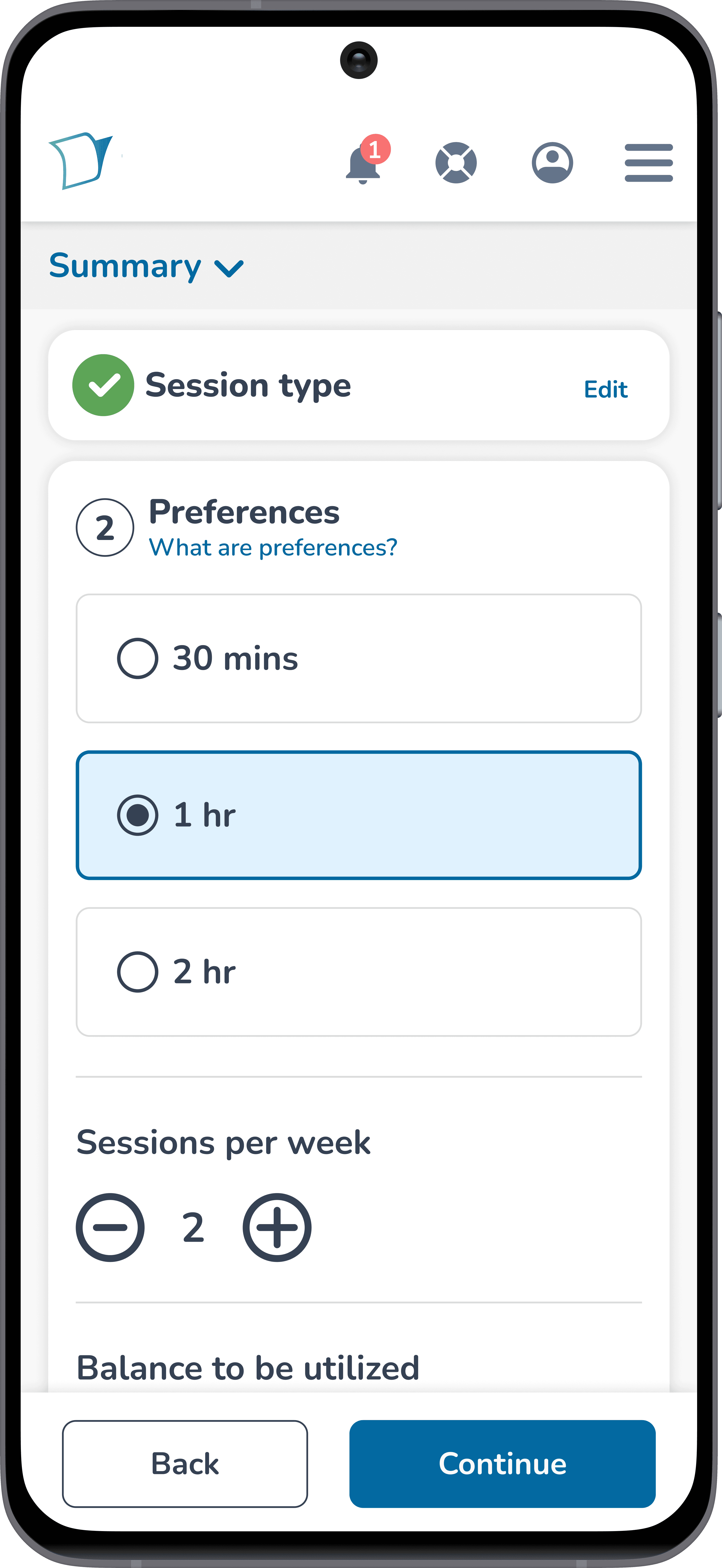
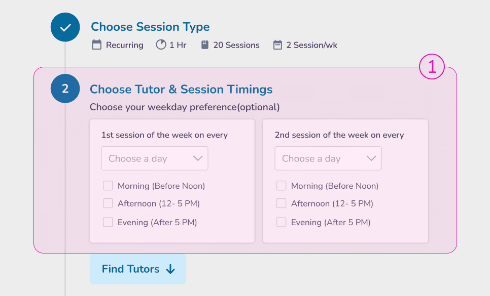
The preferences screen (as shown in the 9.2 image slider) has been reorganized, making it easier to scan. The day and time preference options have been combined to simplify student choices. This change helps to avoid redundancy and facilitates easier decision-making with greater flexibility.
2. Decluttered recurring slot selection.
9.3 Slot selection screen before and after
Surplus information was hidden.
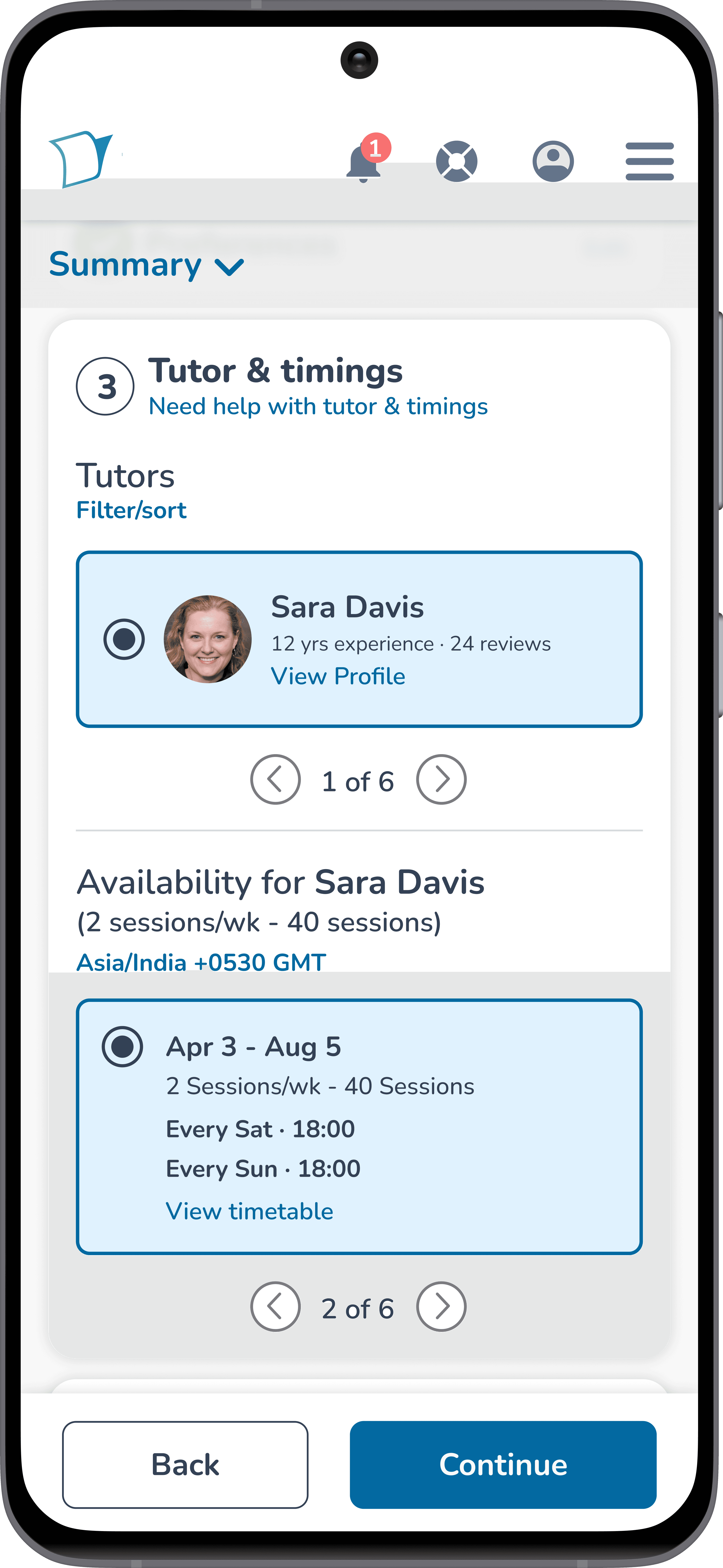
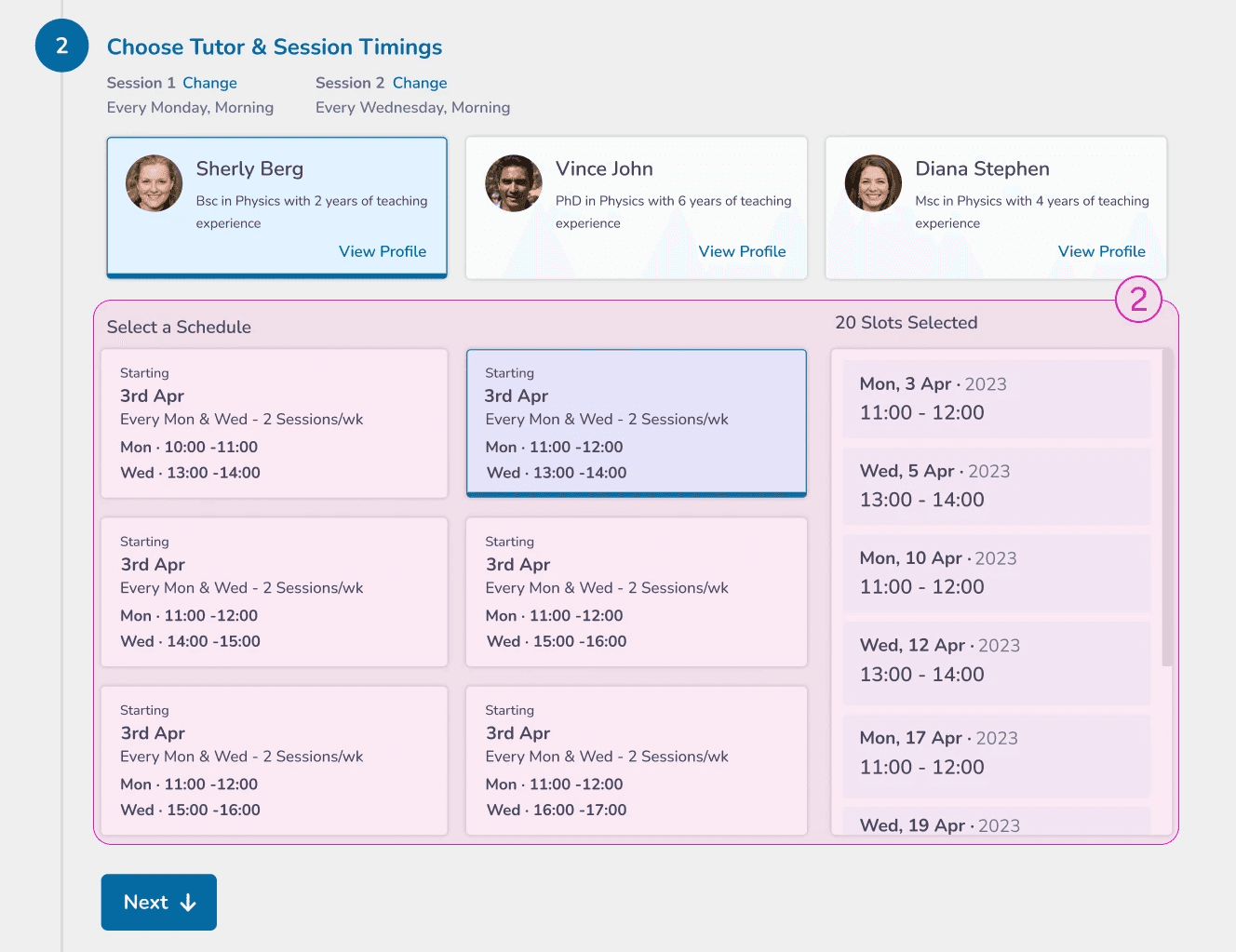
The number of available slots displayed has been reduced to three (as shown in the 9.3 image slider), and pagination has been implemented. With the excess information hidden, students can scan the displayed options more easily and make quicker decisions with reduced cognitive load.
9.4 Timetable modal
Timetable was made into a modal.
The detailed schedule for each recurring slot can now be viewed in a modal (as shown in the 9.4 video loop), rather than in a side pane that previously consumed valuable screen space and contributed to user distraction in the original design.
2.1 Cleaned up flexi slot selection.
9.5 Flexi slot selection screen
Implemented intuitive flexi slot selection.
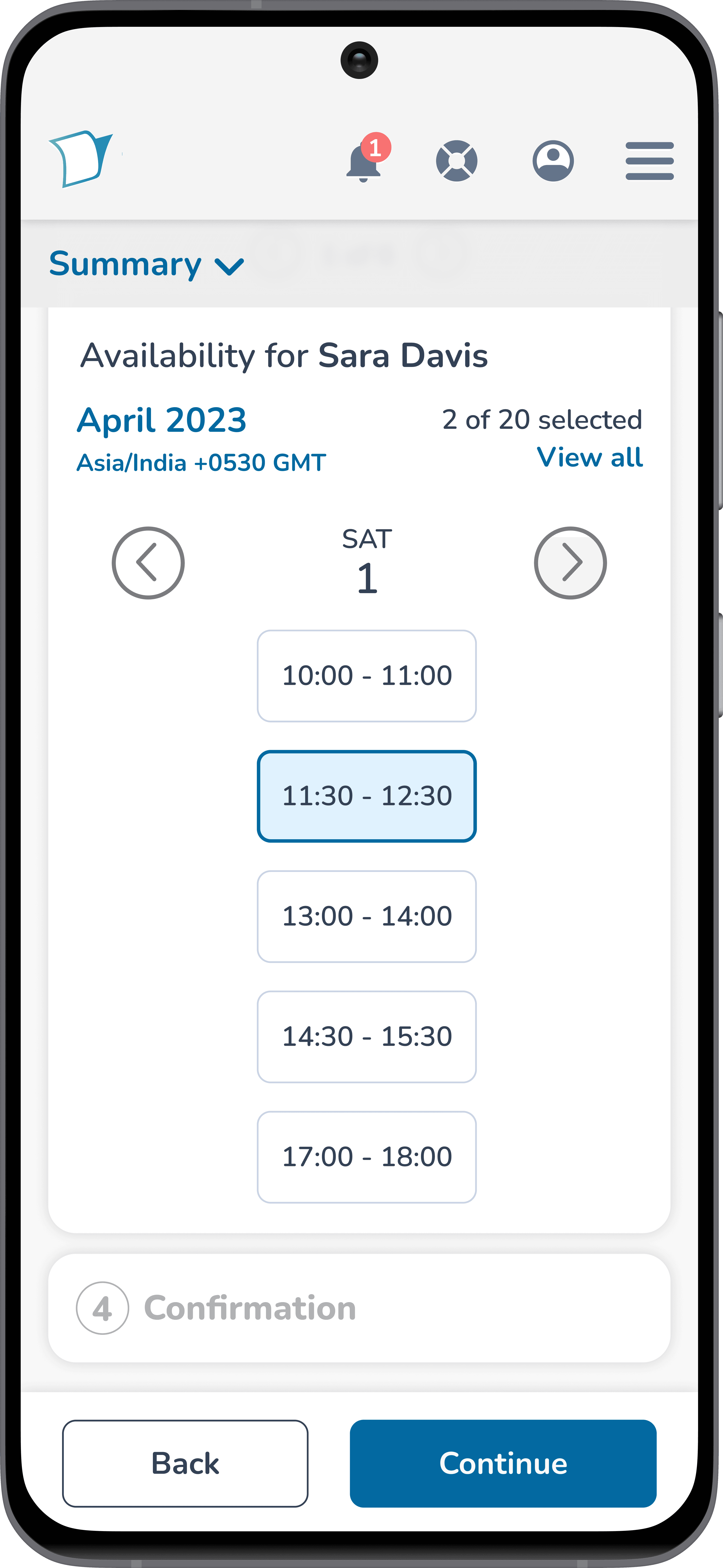
The date selection link has been removed, and a vertical calendar style layout (as shown in the 9.5 image slider) for available slots has been implemented. Additionally, the 'Add Selected' button (as shown in the 9.5 image slider) has been eliminated to enhance intuitiveness and provide a more straightforward user experience.
9.6 Selected flexi slots modal
Optimized the selected slots view.
The selected flexi slots are now consolidated into a modal (as shown in the 9.6 video loop) which is easily accessible with a single click. Students can remove any or all of the slots by opening the modal. Additionally, the page displays the number of both selected and remaining slots available for selection. This arrangement ensures that only the necessary information is visible at a glance, helping users focus on their primary task.
3. Included help centre with tutorials.
9.7 Help centre modal
Improved guidance for new students.
The contextual modal link (as shown in the 9.7 video loop) is placed at each step of the scheduling process. This allows students to access assistance without losing their place in the context of scheduling. The help centre includes detailed documentation and tutorial videos to aid new students in familiarising themselves with the process when they encounter difficulties.
4. Revised the entire flow experience
9.8 The revised recurring flow
9.9 The revised flexi flow
A fresh redesign.
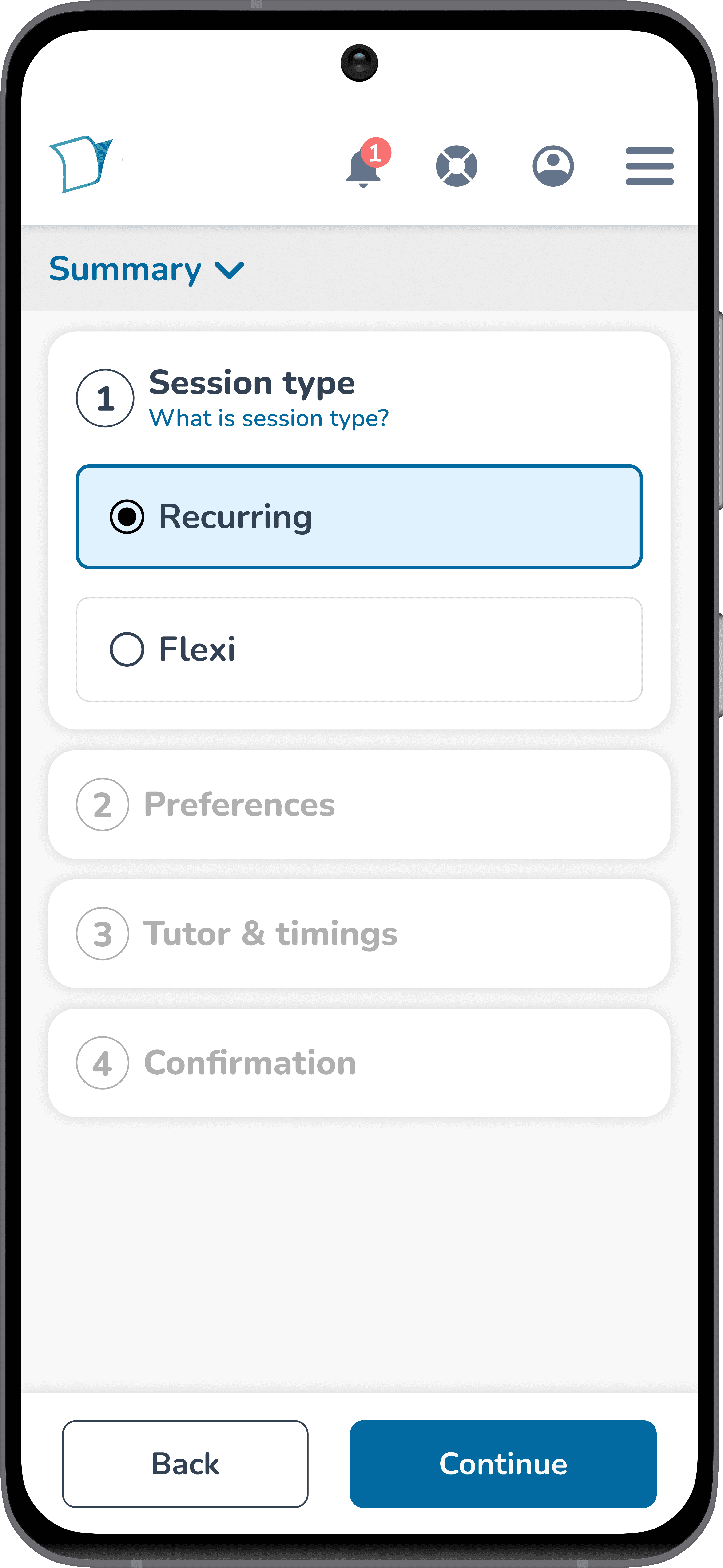
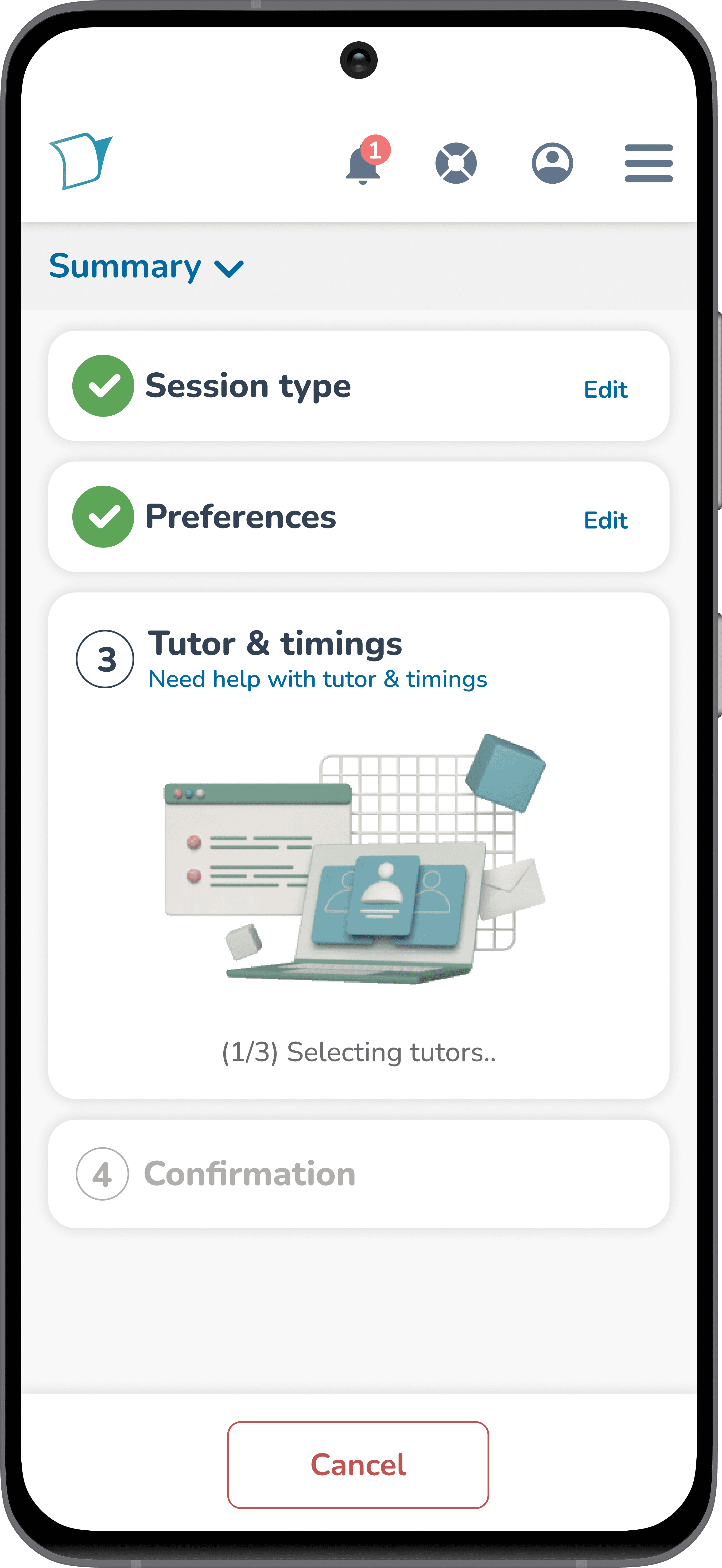
As shown in video loops 9.8 and 9.9, the entire flow has been redesigned with a fresh, simplified interface. Each step is clearly marked, and the status is displayed using check marks. A summary tab has been added to highlight all the relevant options chosen. Non-essential information has been hidden using modals, and an 'Add to Calendar' button has been included at the confirmation step. These upgrades collectively enhance the experience for students without compromising any features from the original design.
TAKEAWAYS
Looking back!
Involving cross-functional partners from the start
Engaging cross-functional partners from the outset ensures that the project progresses in a holistic manner, taking into the account aspects like usability and technical feasibility right from the beginning.
