Creating a tool for pharma executives to streamline process optimization
Heingrid Pharma · Mobile app · 2025
MY ROLE
UX/UI Designer, Researcher
TEAM
Product Owner, Developer
MODEL
B2B
TIMELINE & STATUS
8 weeks, Launched in June 2025
OVERVIEW
Heingrid Pharma is a pharmaceutical company that specializes in the sales and marketing of therapeutic drugs in India. The company promotes its products through qualified business executives who primarily engage in in-person visits with licensed medical practitioners.
HIGHLIGHTS
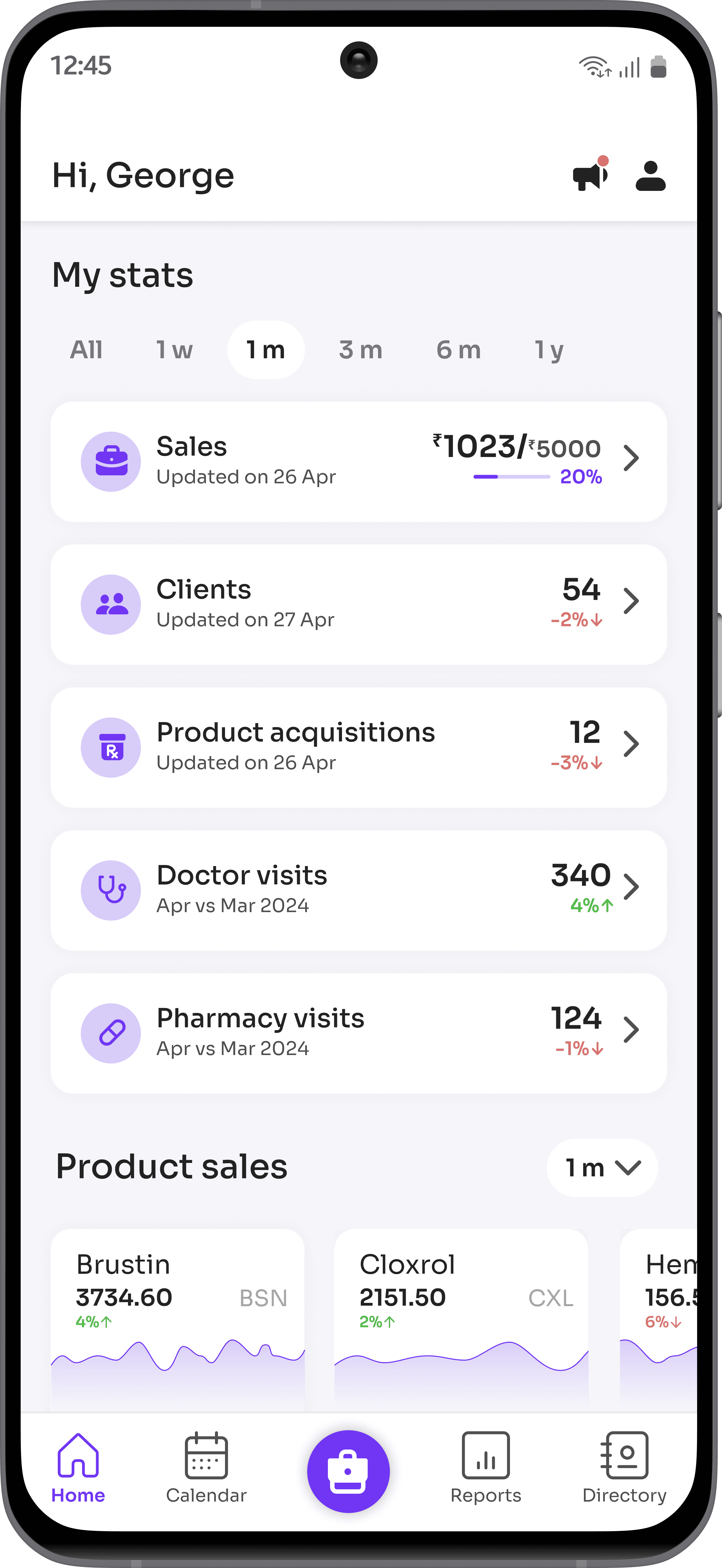
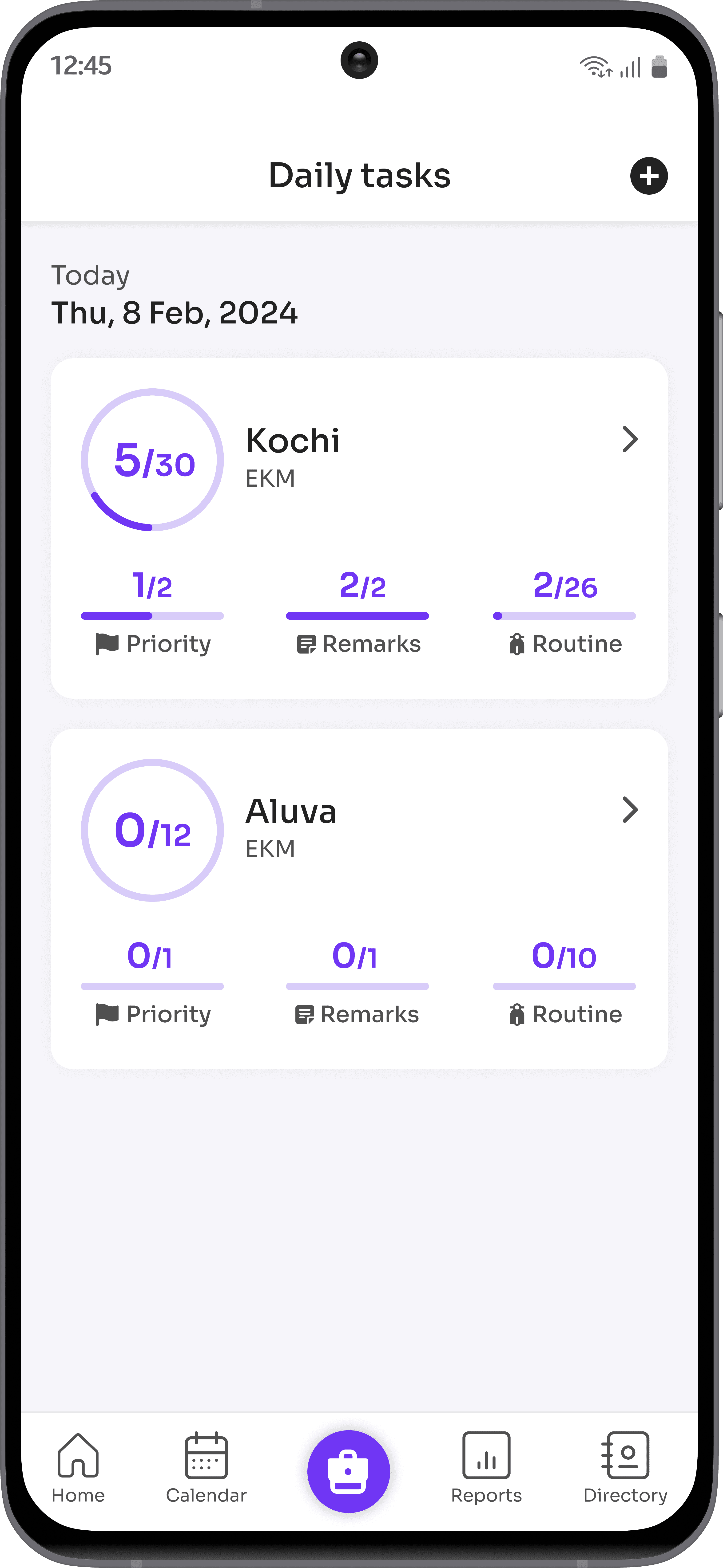
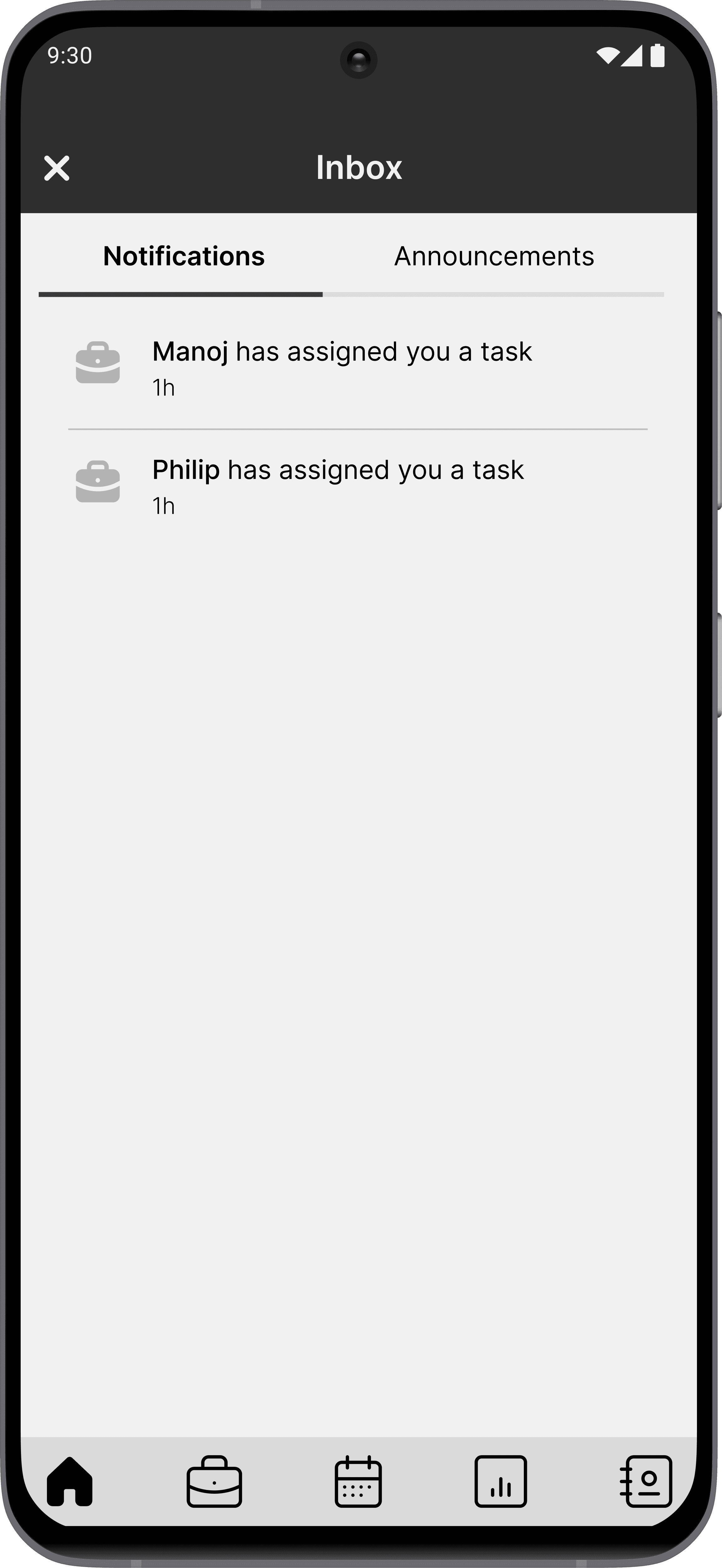
We launched Star, an all-in-one mobile app designed for business executives at Heingrid Pharma. This tool enhances efficiency and productivity by streamlining processes and optimizing their workflow.
1.0 Star app highlights
IMPACT
After two months of the launch, the app recorded:
CONTEXT
The Indian pharmaceutical industry and its business executives.
India's pharmaceutical market ranks among the largest in the world.
The pharmaceutical sales market in India is highly competitive, driven by a large consumer base, numerous domestic and international players, and strong manufacturing capabilities.
3.0 The indispensable role of business executives in the Indian pharmaceutical industry
The business executives serve as the primary point of contact with healthcare providers.
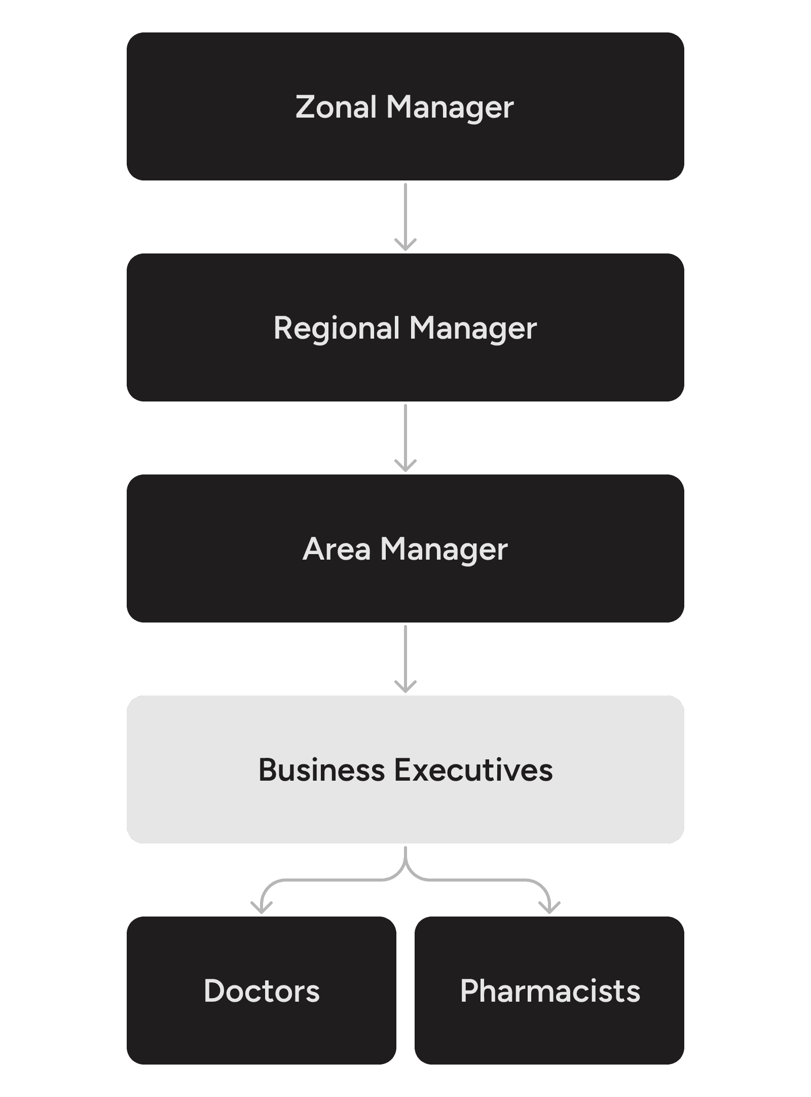
In this competitive market, business executives play a vital role as intermediaries between pharmaceutical companies and healthcare providers. Their responsibilities in building relationships, educating stakeholders, and gathering market intelligence position them as key players in their firm's success.
PROBLEM
The use of outdated tools for work was adversely impacting the business.
The existing tools for business executives were neither optimized nor efficient for their tasks.
The executives use a combination of an outdated web app and third-party applications, such as WhatsApp and Google Sheets, to carry out their tasks. However, they have reported difficulties in using these tools, which negatively affects their performance at work.
As the first step towards process optimization, it is essential to closely examine the workflows and operations of executives.
The main tasks associated with the business executives are:
Daily tasks include, but are not limited to, visiting assigned doctors and pharmacies to maintain and increase sales.
Tour planning involves developing a work plan for the upcoming month and presenting it to management to ensure they are informed.
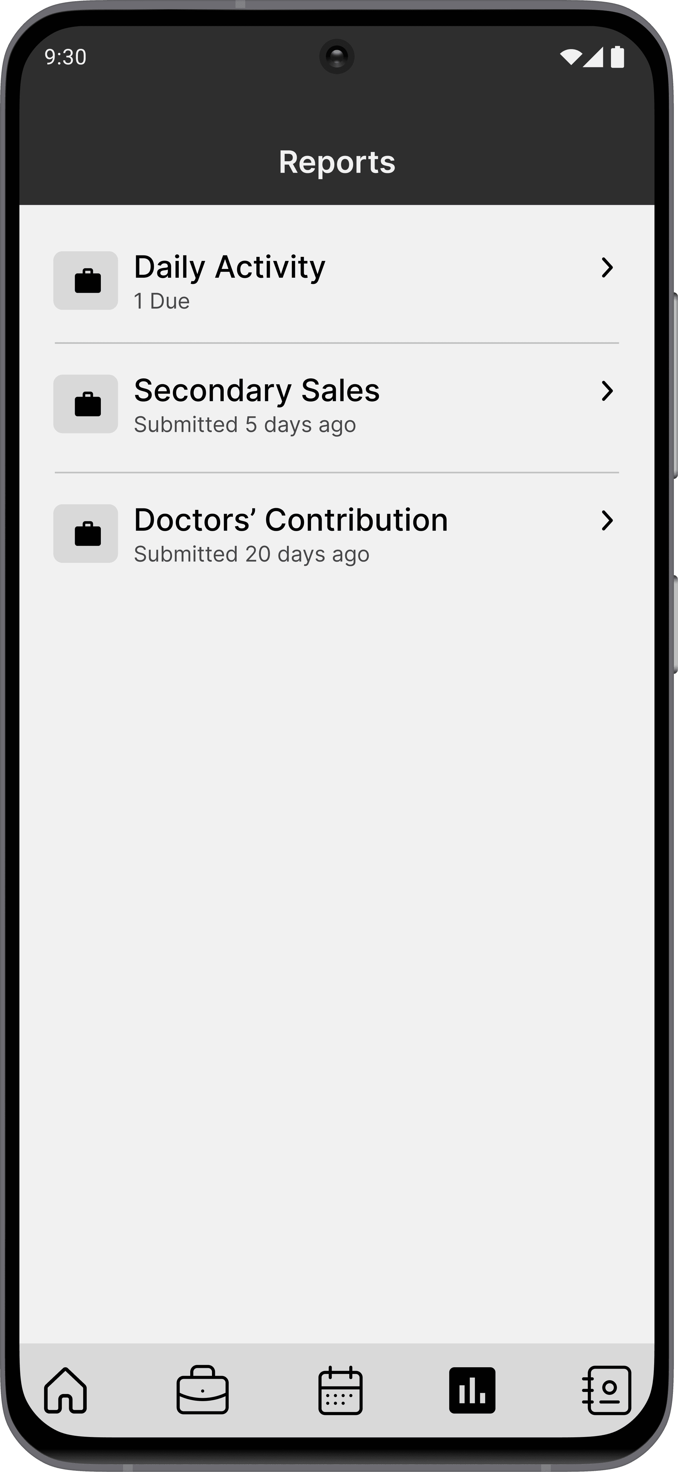
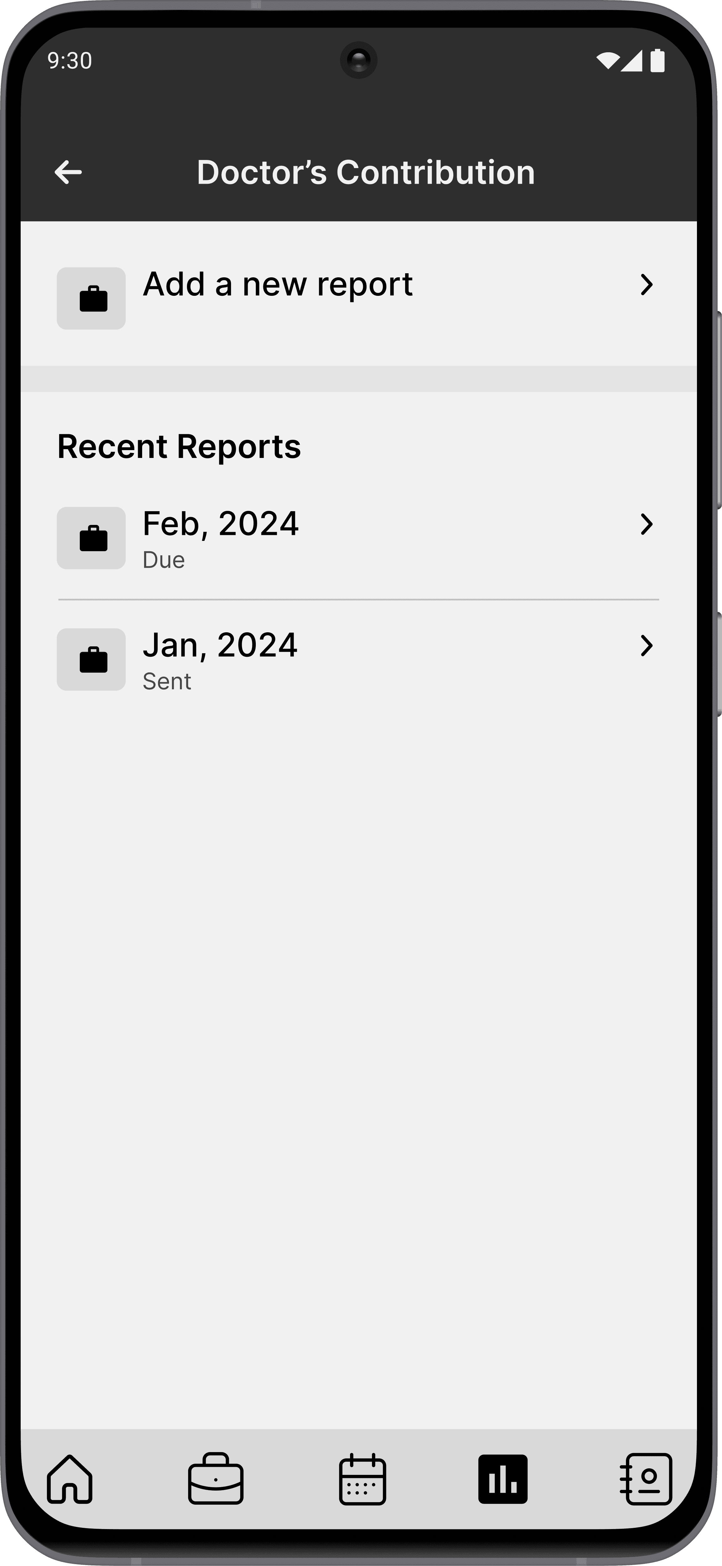
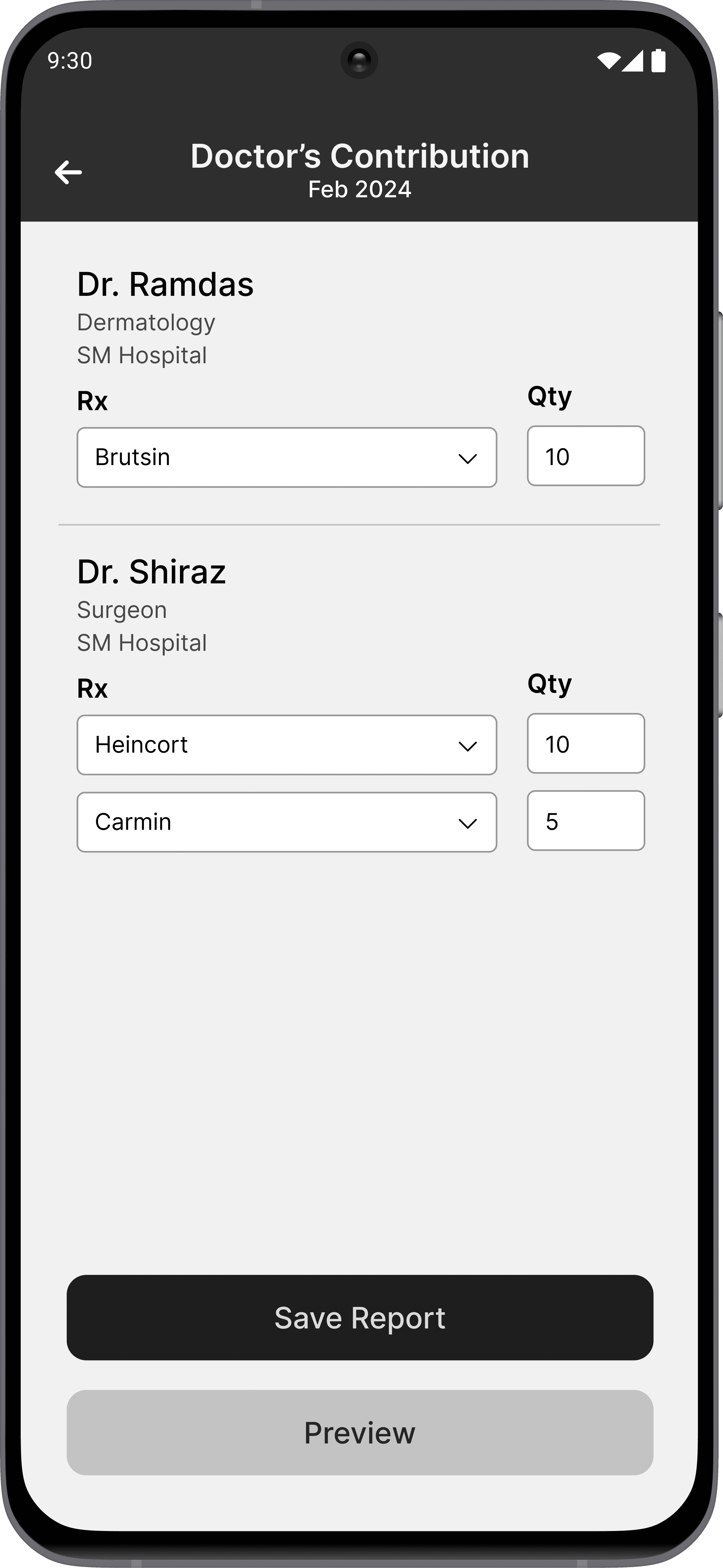
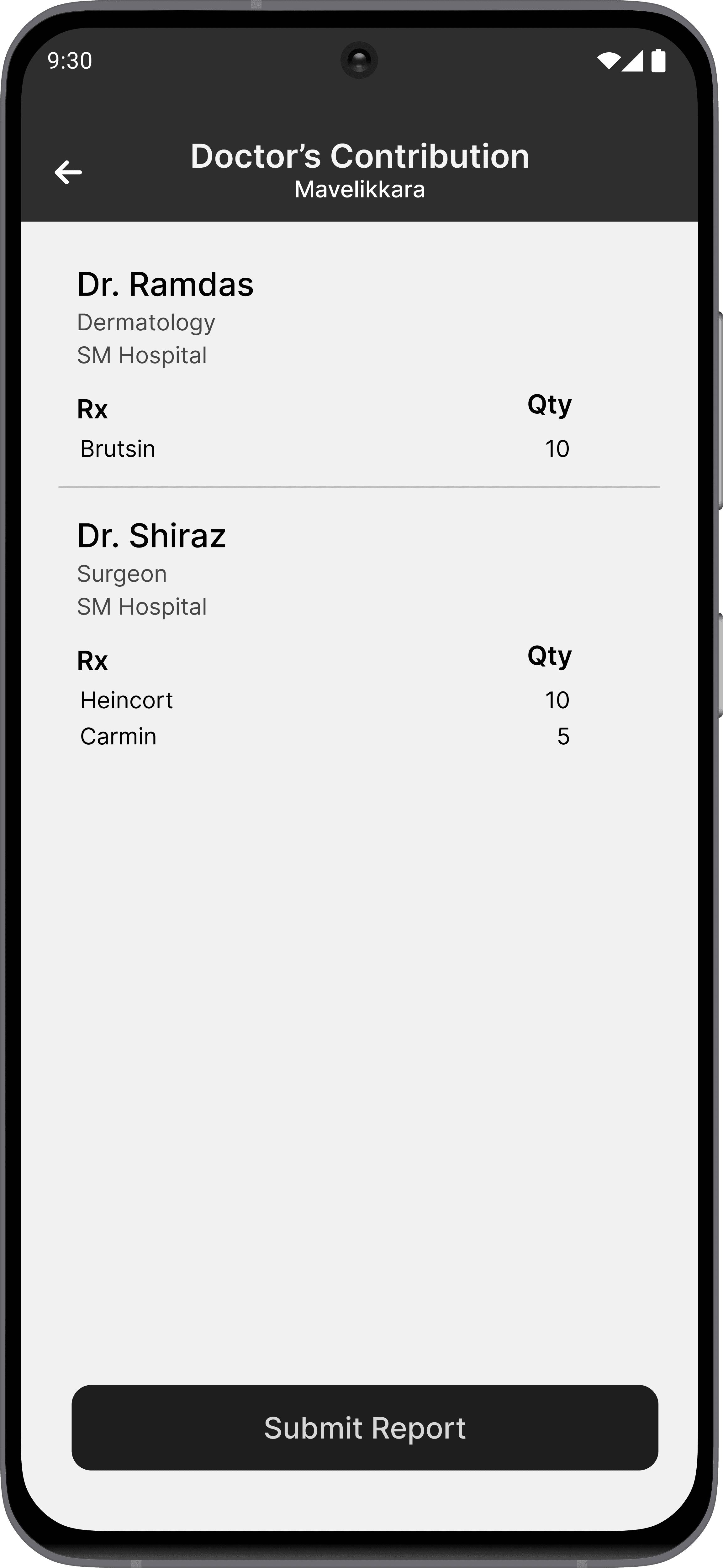
Secondary sales and doctors' contributions are reports that must be submitted monthly, based on data collected from various sources in the field.
User interviews were conducted with 8 business executives and 4 management staff.
From the interviews, three major issues were identified.
Managing tasks and schedules using multiple unintegrated systems leading to disorganization and missed opportunities.
The large volume of information to be managed causing inefficiencies.
Inflexible monthly and daily plan creation resulting in poor utilization of time and resources.
PROBLEM STATEMENT
To develop a digital tool for business executives at Heingrid Pharma who are experiencing inefficiencies and missed opportunities due to the absence of an integrated digital solution for managing sales tasks, tour planning, and reporting.
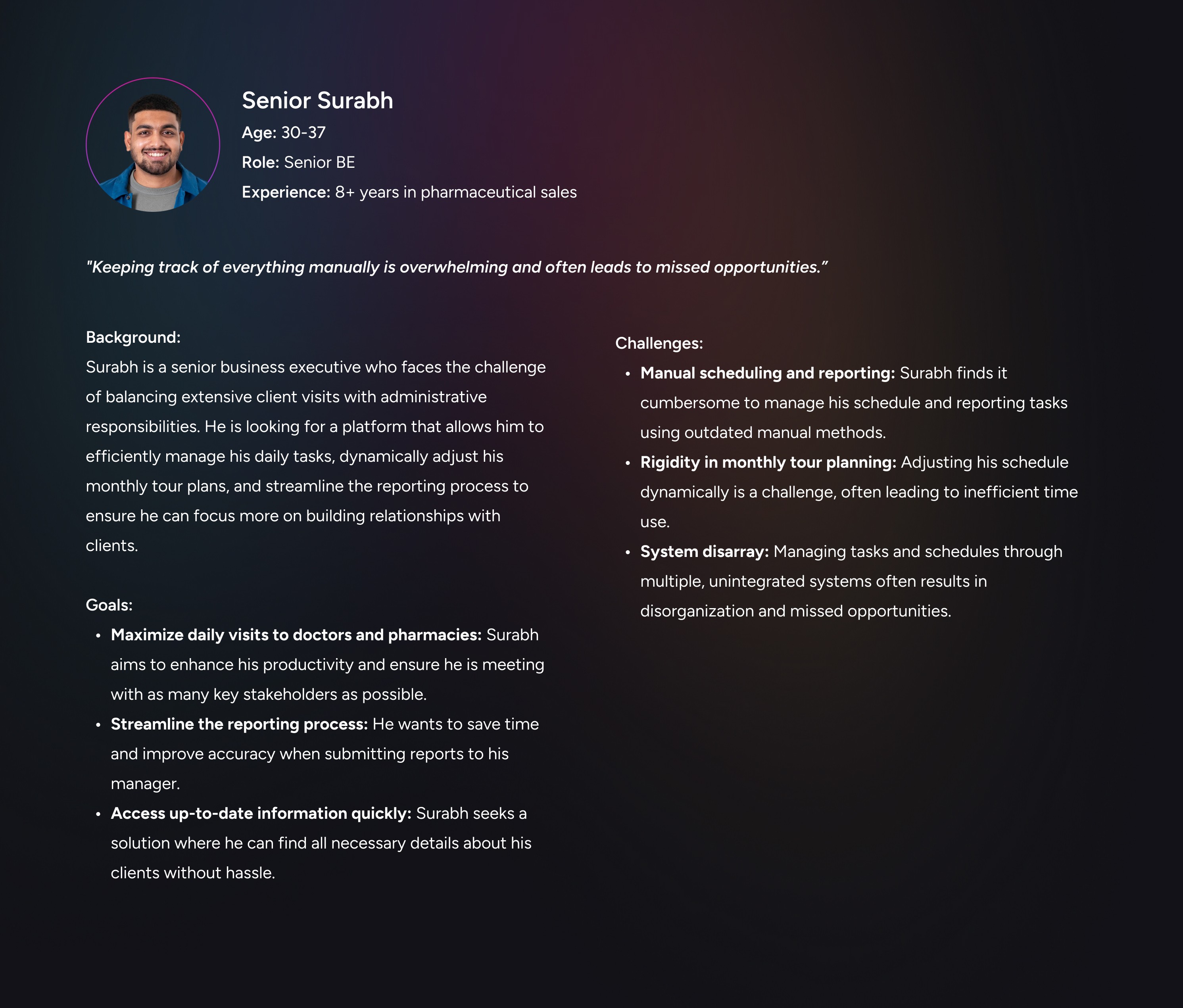
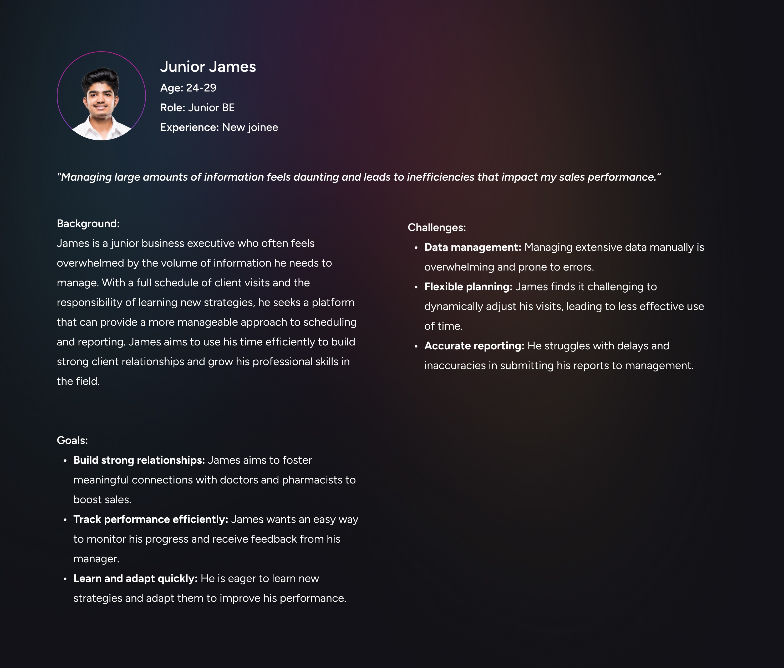
Two user personas were developed.
The personas were utilized to ensure that the project's objectives were aligned across the team.
4.0 The senior persona
4.1 The junior persona
PROCESS
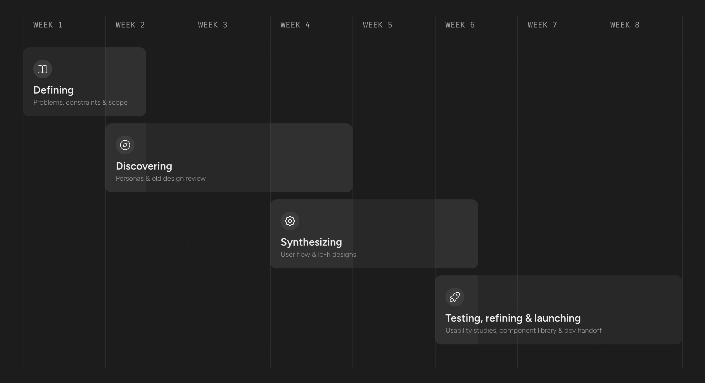
The MVP was delivered in 8 weeks.
5.0 The project timeline
DISCOVERY
Deriving solutions and understanding prospects.
The management team believes that a mobile app would be the ideal solution.
The executives were also in favour of a mobile application that allows them to complete their tasks and submit reports more conveniently, as they will be travelling for most of their work.
Identifying opportunities.
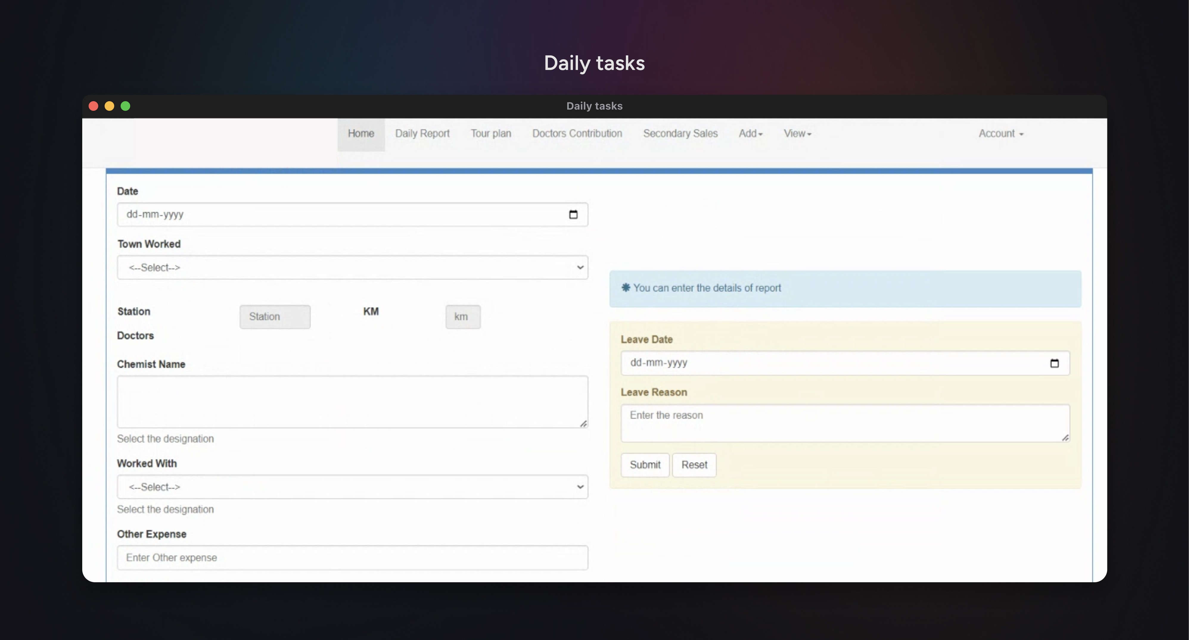
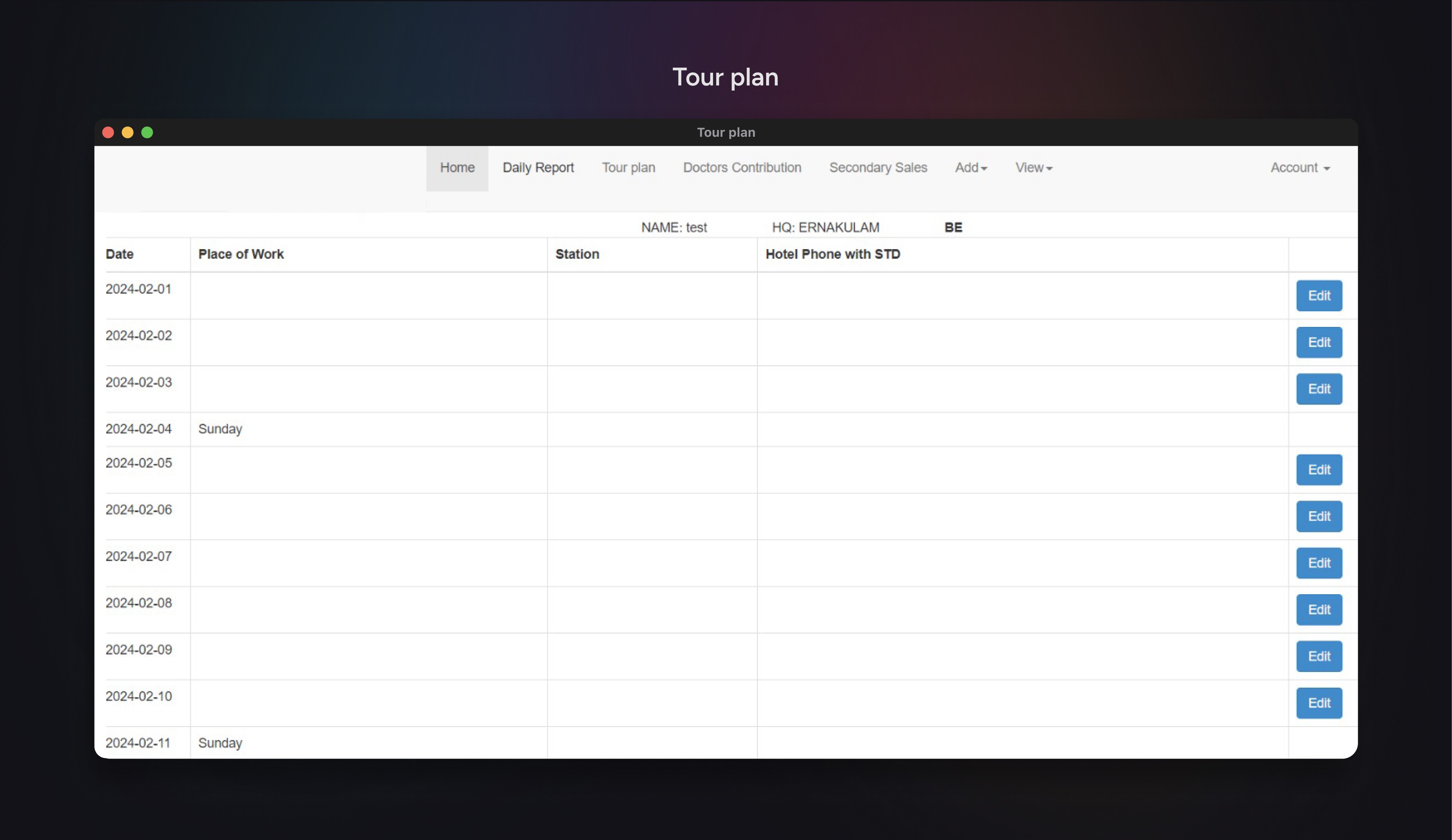
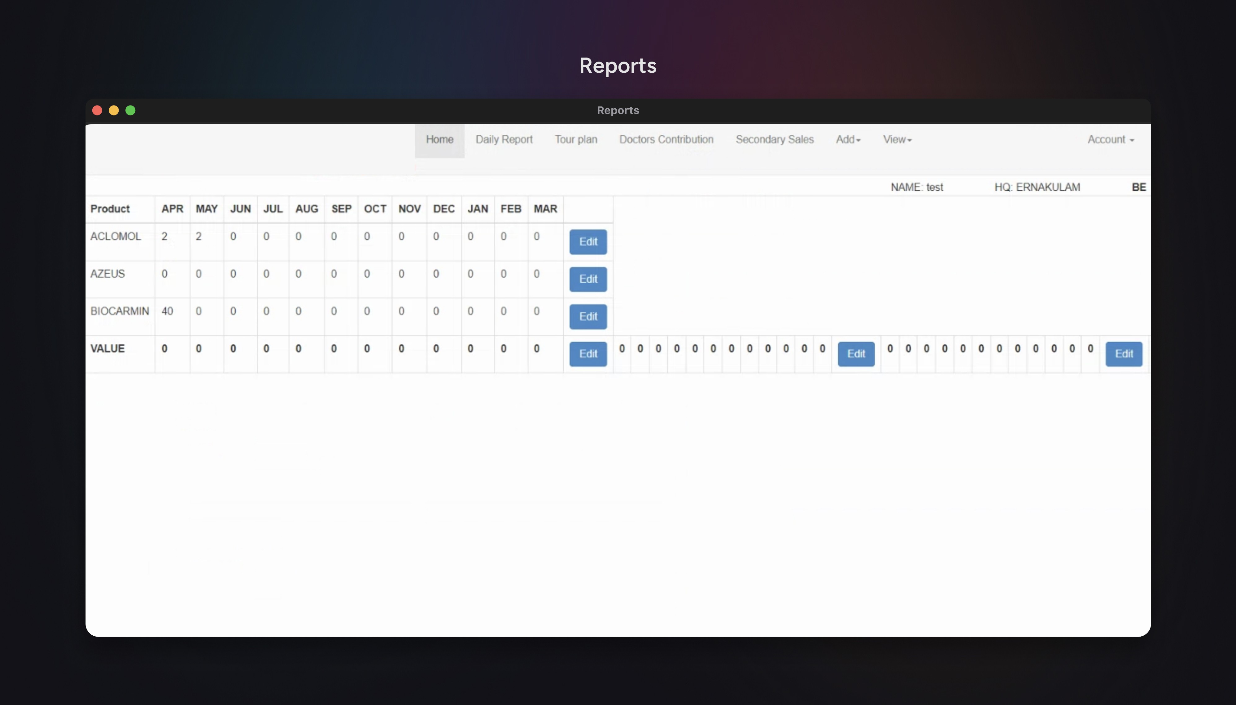
We collaborated with the executives and management on each screen of the old web app to identify areas for improvement while taking into account the constraints and opportunities of a mobile application.
6.0 The daily tasks page
Potential opportunities in daily tasks.
Effective monthly tour planning
Additional information may be gathered from each doctor and pharmacy visit, including orders, samples, and gifts, which can be utilized to plan monthly tours and follow-ups.
Site visit validation
The location data from the smartphone may be utilized to validate site visits.
6.1 The tour planning page
Potential opportunities in tour planning.
Map tour plan with daily tasks
The tour plan for each day consists of a set of tasks which may be directly mapped to the daily tasks.
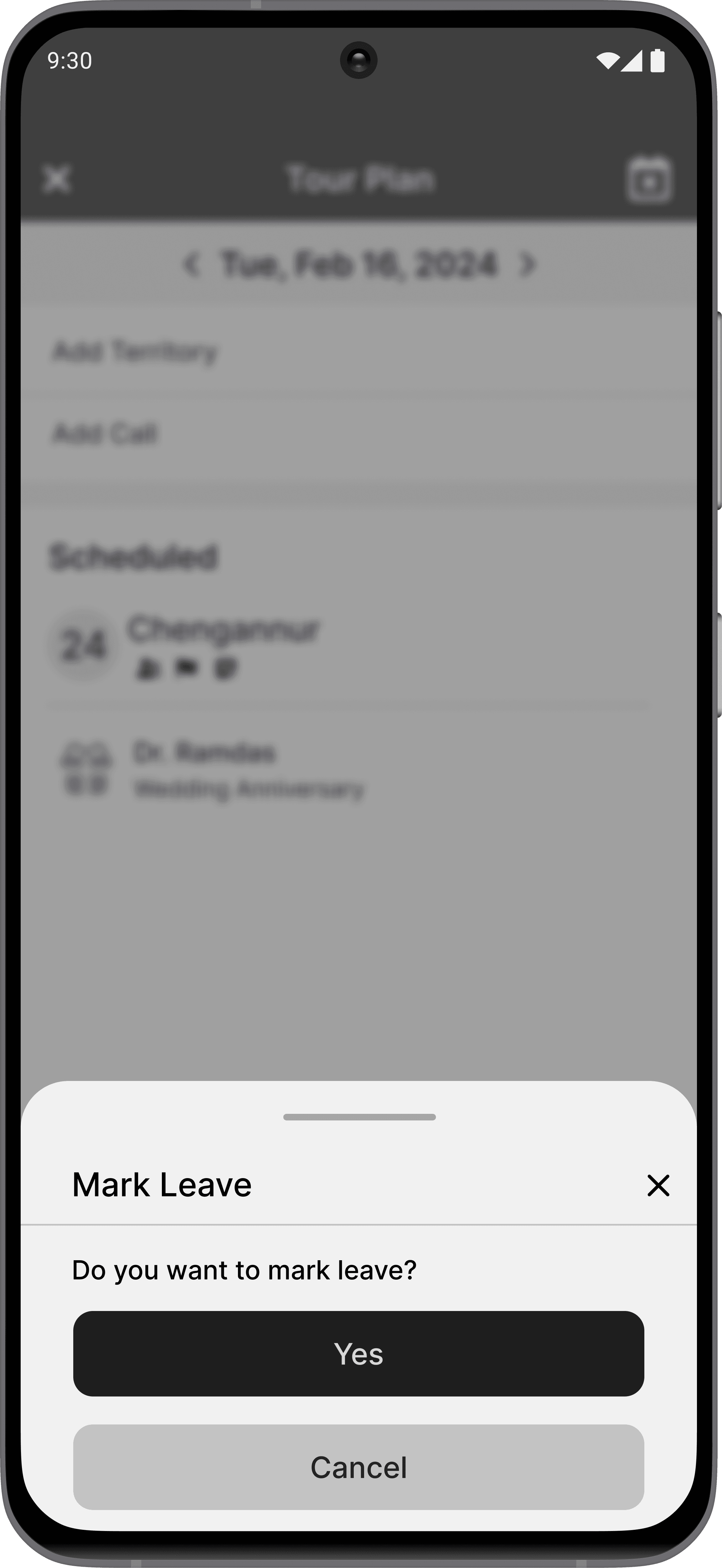
Integrate leave marking
The leave marking may be integrated to the tour calendar rather placing it in the daily tasks as shown in Image 6.0.
Adding important dates to tour calendar
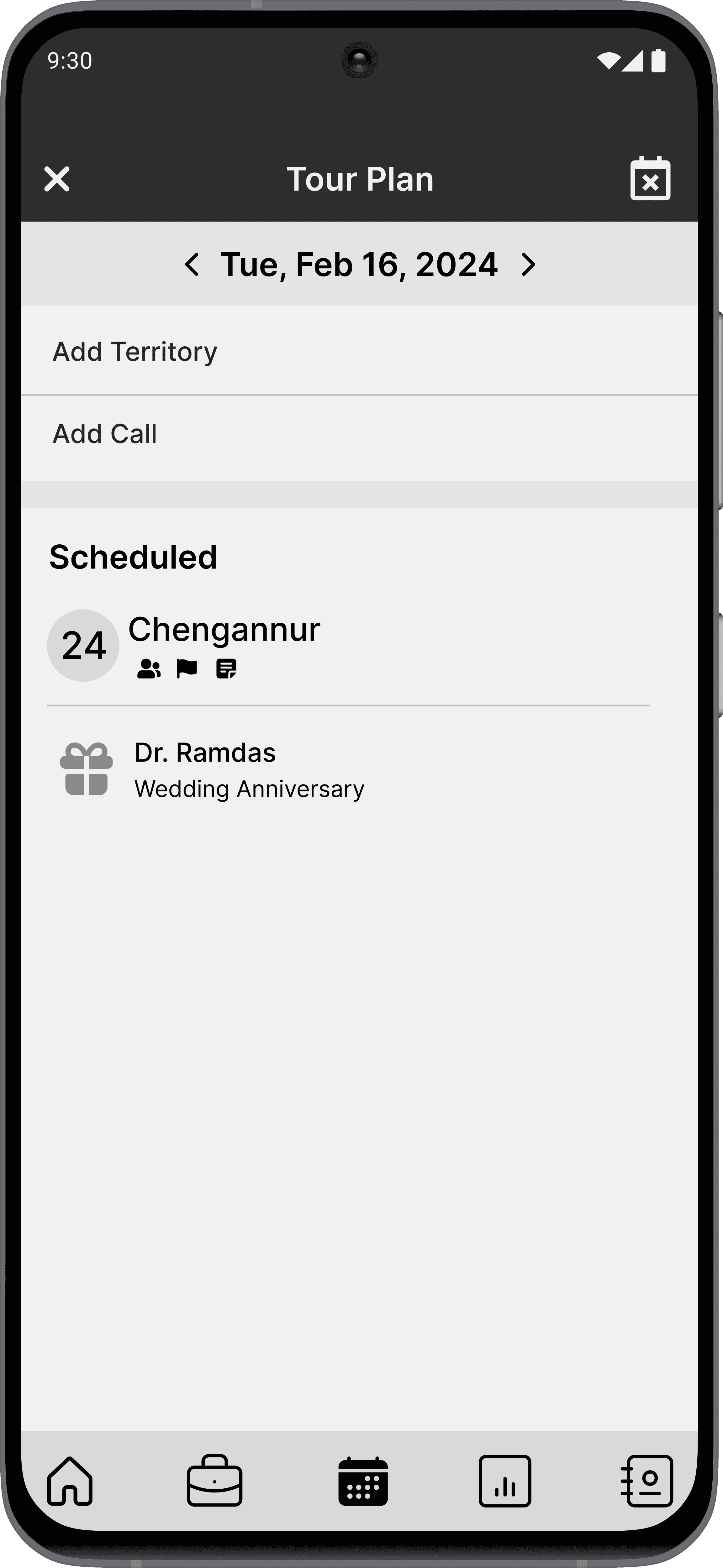
Client anniversaries and birthdays can be included in the calendar and utilized during tour planning to help strengthen relationships.
6.2 The sales report page
Potential opportunities in reports.
Error-free reports
The reports may be created as drafts and can be submitted after previewing to ensure accuracy.
Add-on features proposed.
Dashboard and gamification
A dashboard can be included on the home screen to display key performance metrics, while gamification features can be employed to improve productivity.
Message broadcasting
A message broadcast feature can be incorporated to allow management to send messages to various groups or executives within the app.
KEY DISCOVERY
A centralized directory feature that allows for quick access to updated doctor/pharmacy information.
INITIAL DESIGNS
The initial prototypes were created by incorporating suggested improvements and identified opportunities.
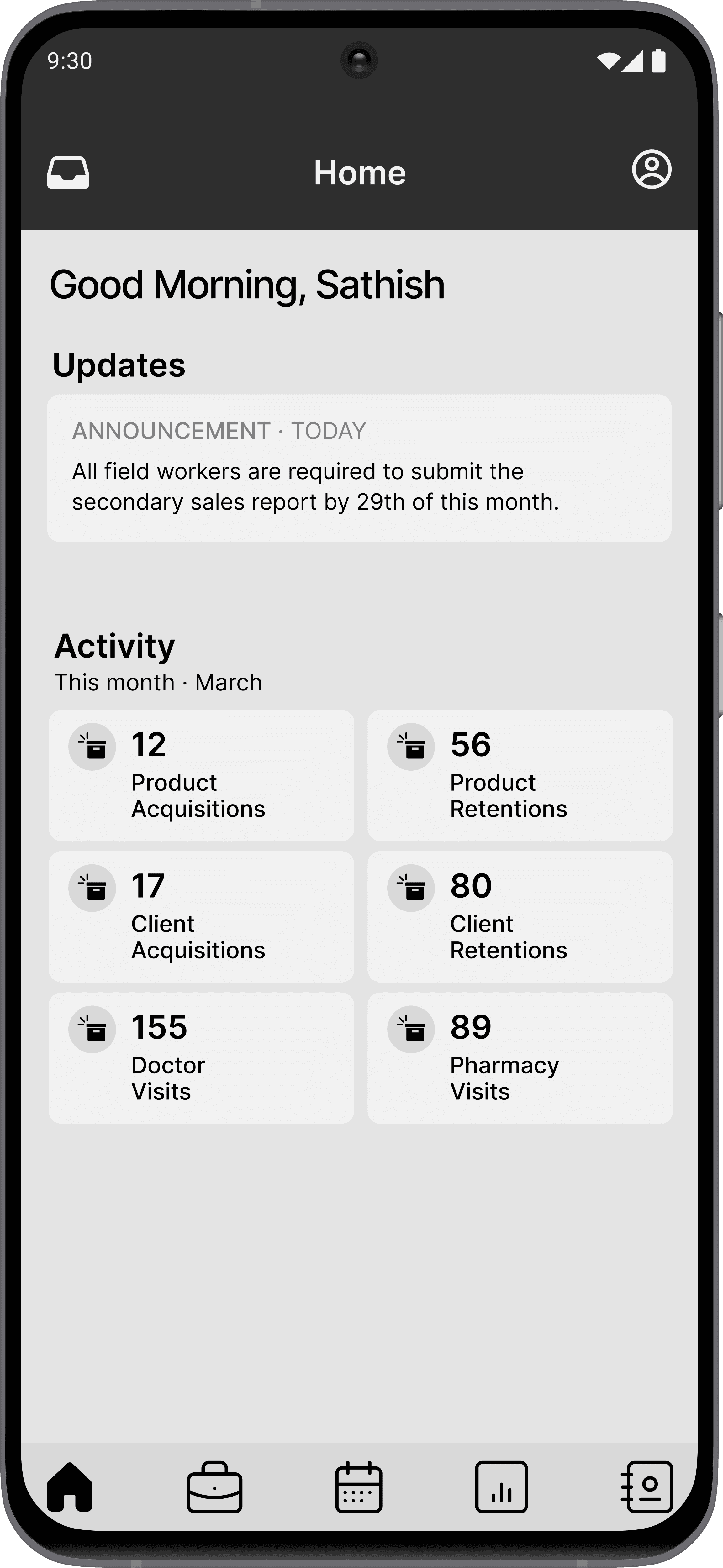
The prototype consisted of five major nav menu items.
These menu items were created based on the types and frequencies of tasks carried out by the executives.
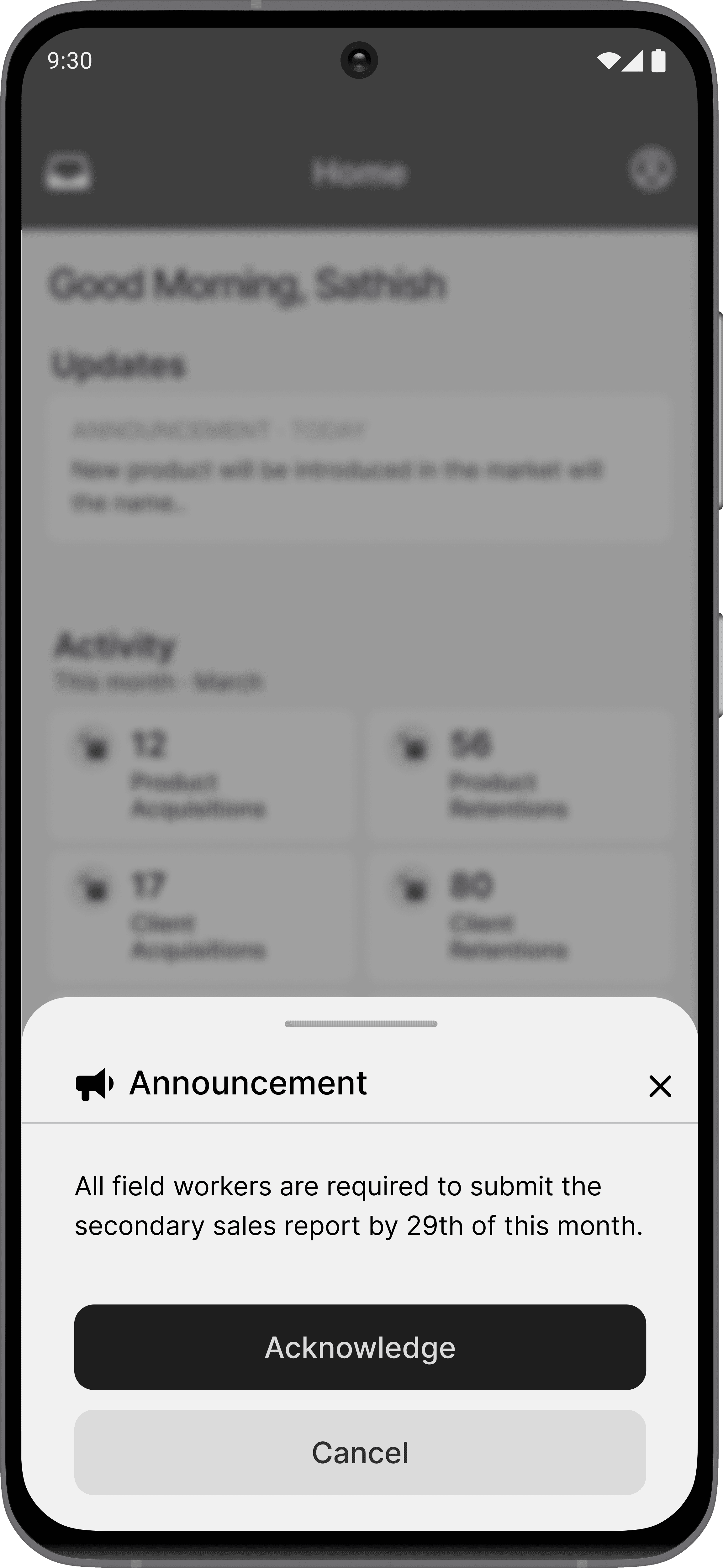
Updates section: The broadcasted messages were listed under updates section, with the option to acknowledge each message for accountability.
Activity dashboard: All key performance metrics for the executive were displayed under activity section to provide a sense of achievement and motivation.
7.0 Home screen highlights
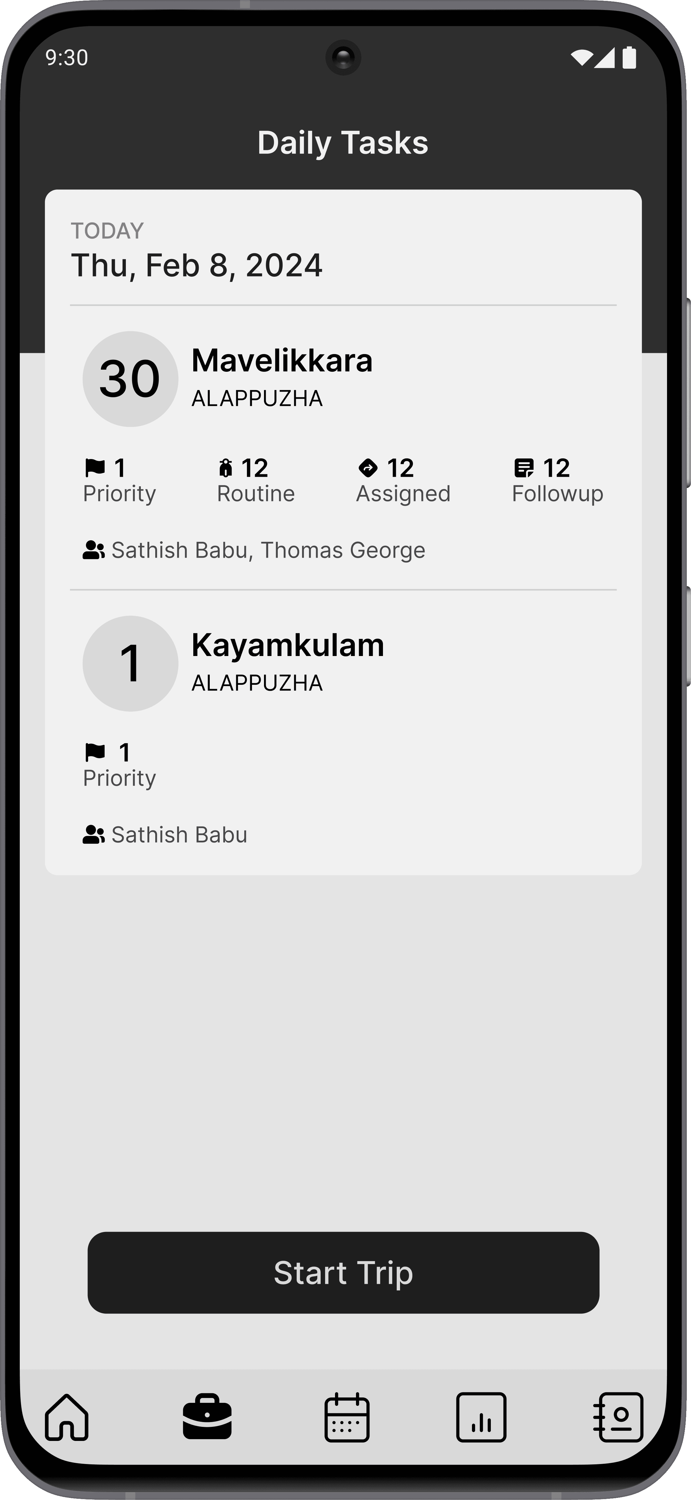
Daily tasks overview: An overview of all the tasks assigned for the day was provided, along with a breakdown of categories for better preparedness.
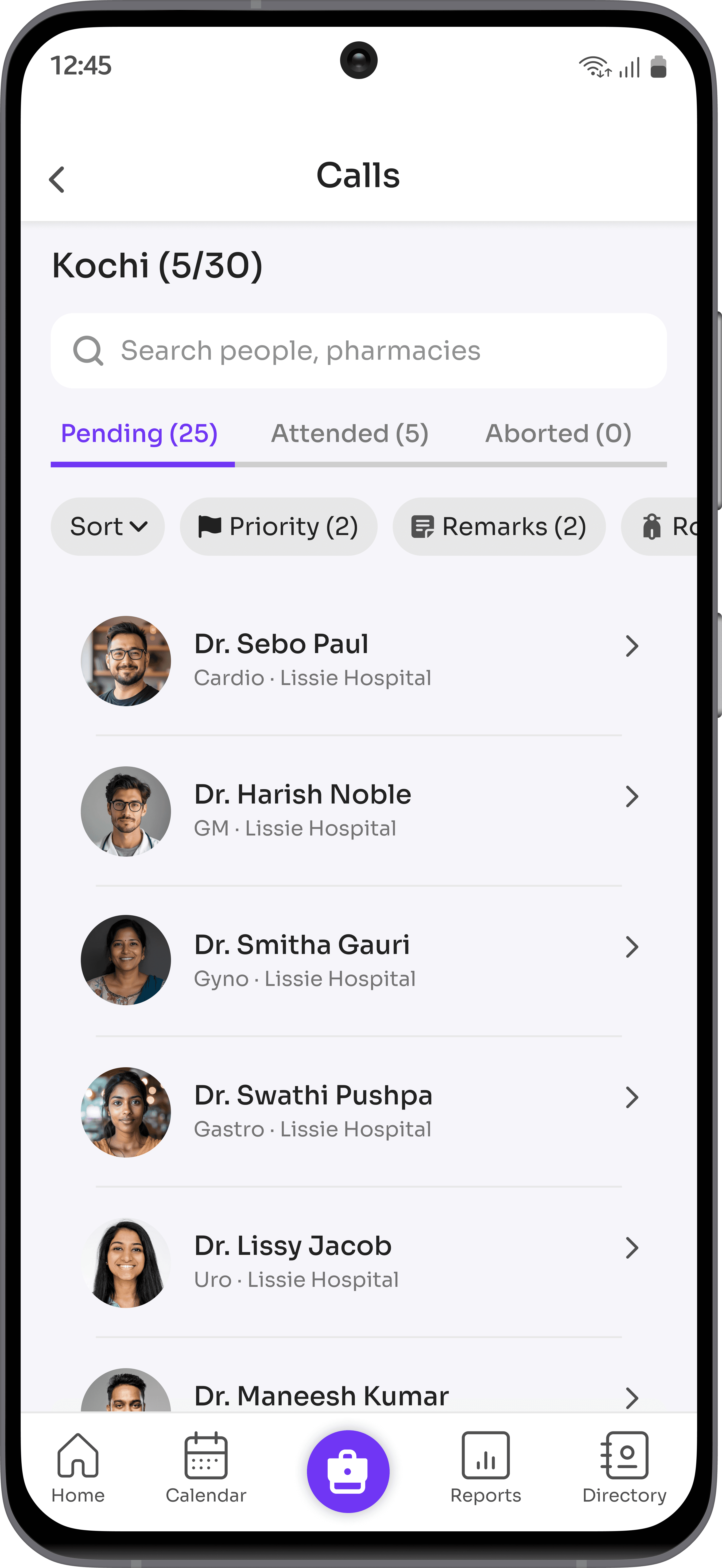
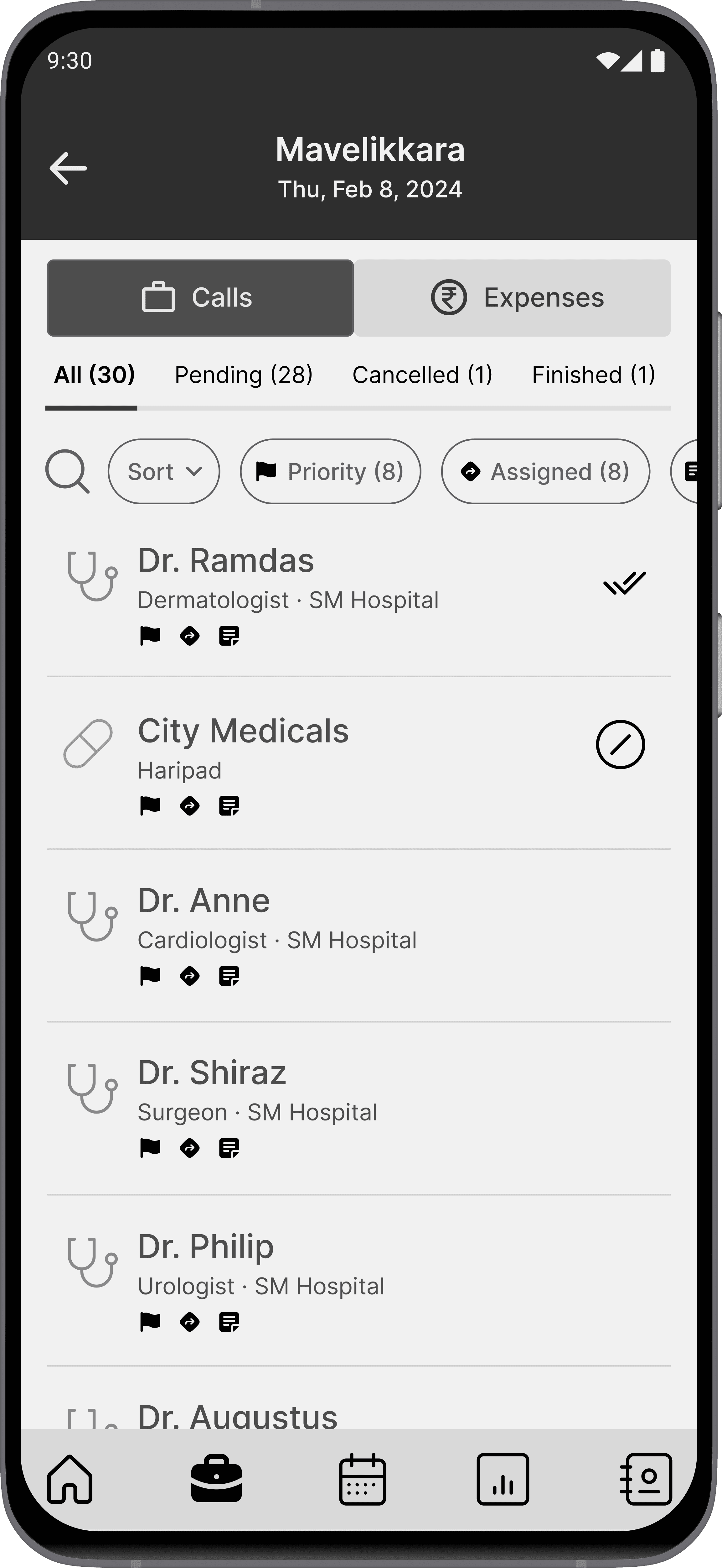
Calls: The status of each task was displayed, and the tasks are categorized by their status, along with a task completion count to help assess progress.
7.1 Daily tasks screen highlights
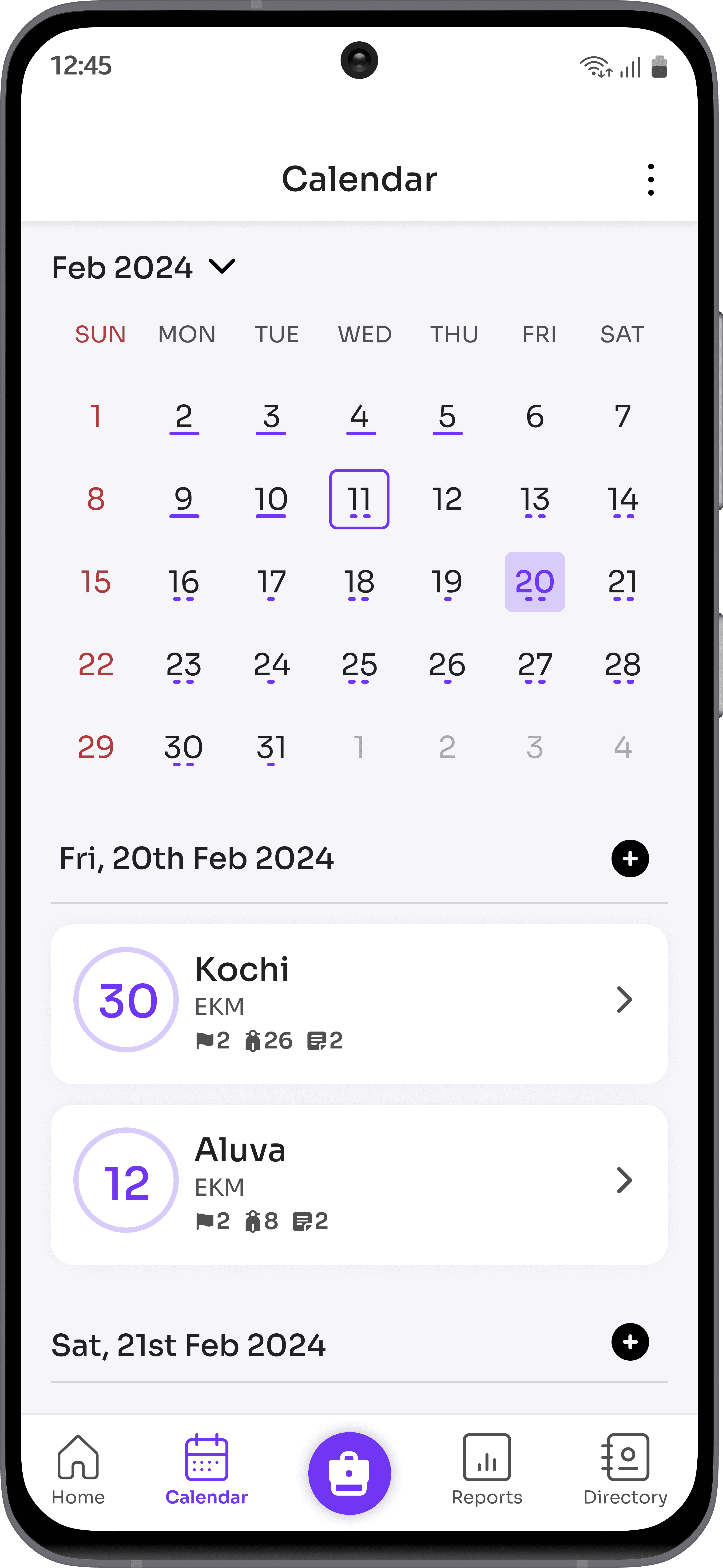
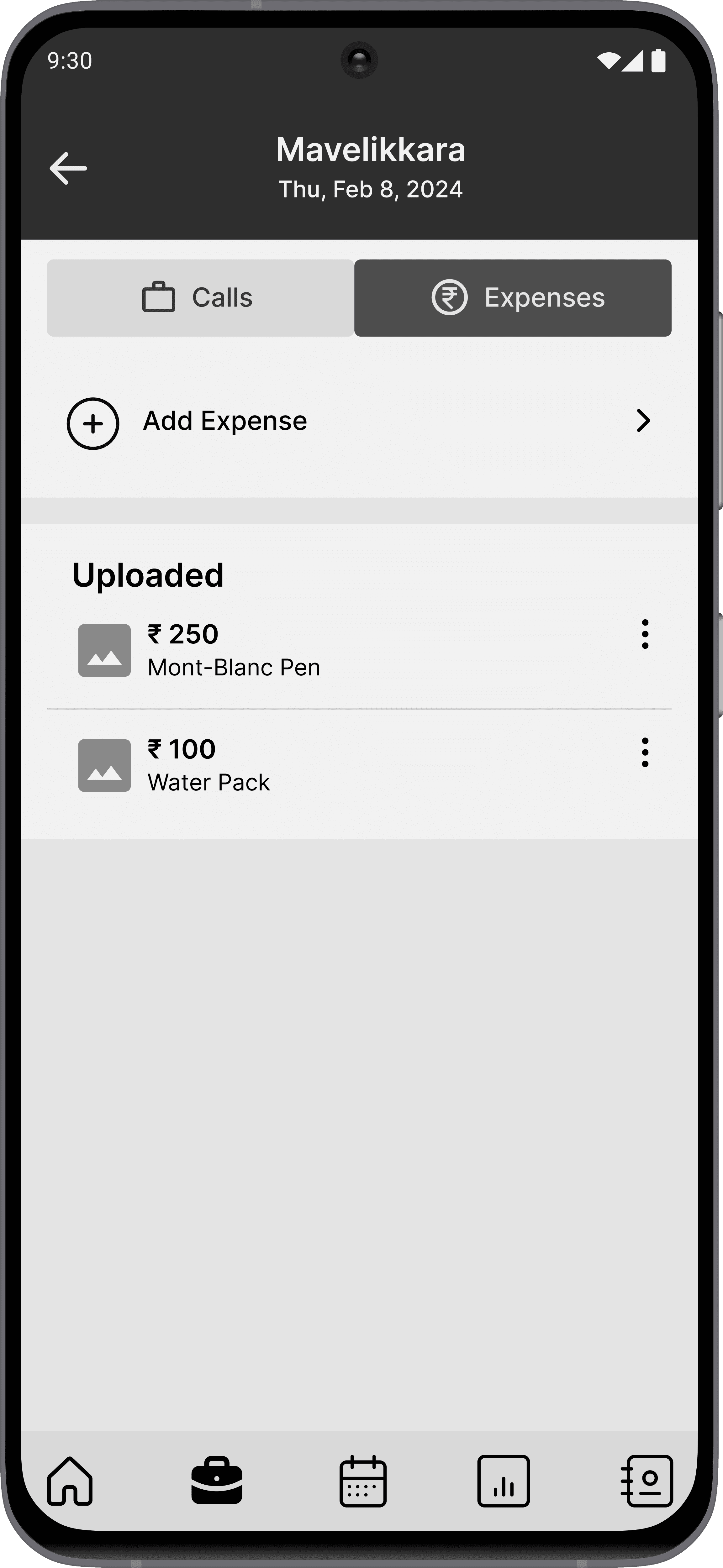
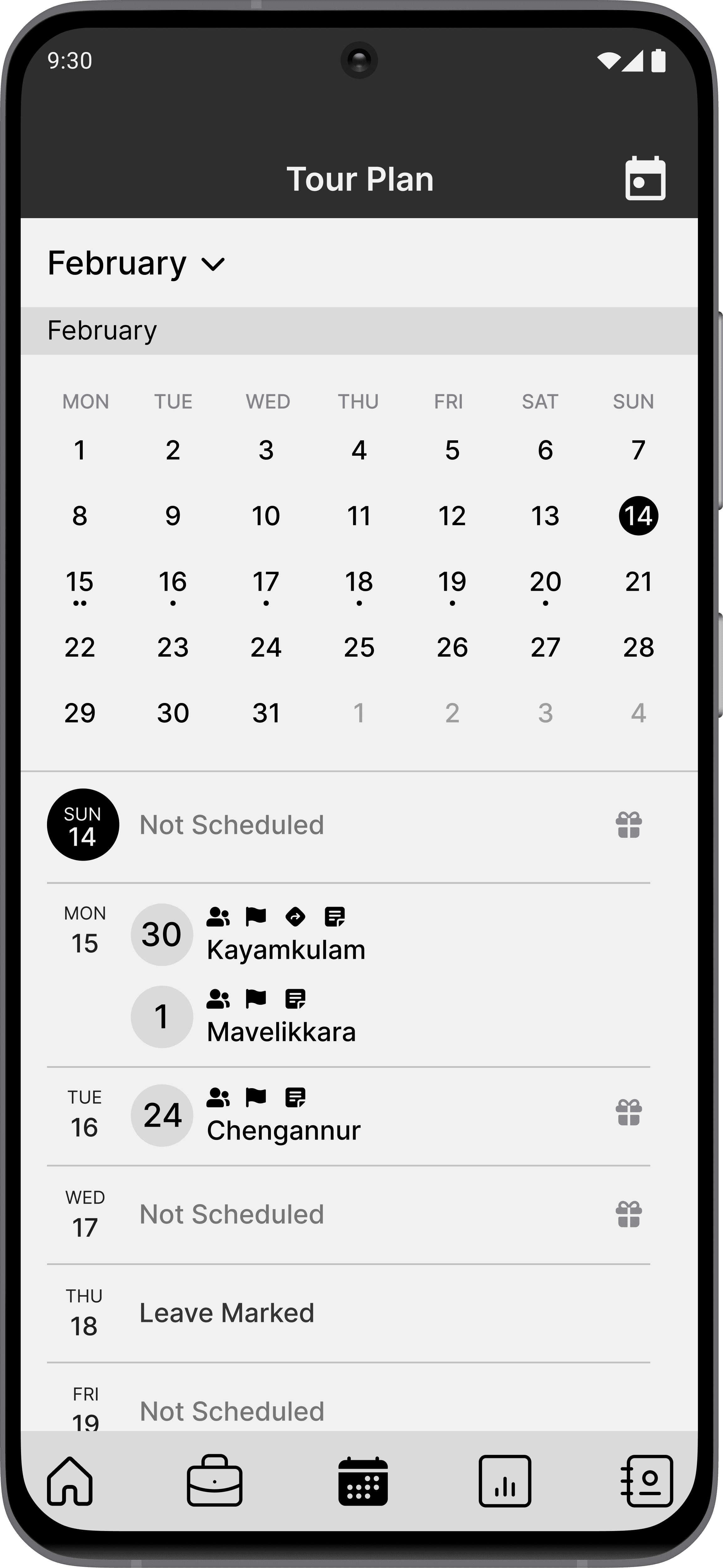
Calendar, list and day view: Different view types with varying levels of detail have been introduced to enhance clarity and ease of use.
Leave marking: The leave marking feature has been relocated to the tour plan for enhanced convenience.
7.2 Tour plan screen highlights
All in one place: All types of reports can be easily created, viewed, and submitted in one convenient location.
Drafts and previews: Drafts and previews modes for reports were also included.
7.3 Reports screen highlights
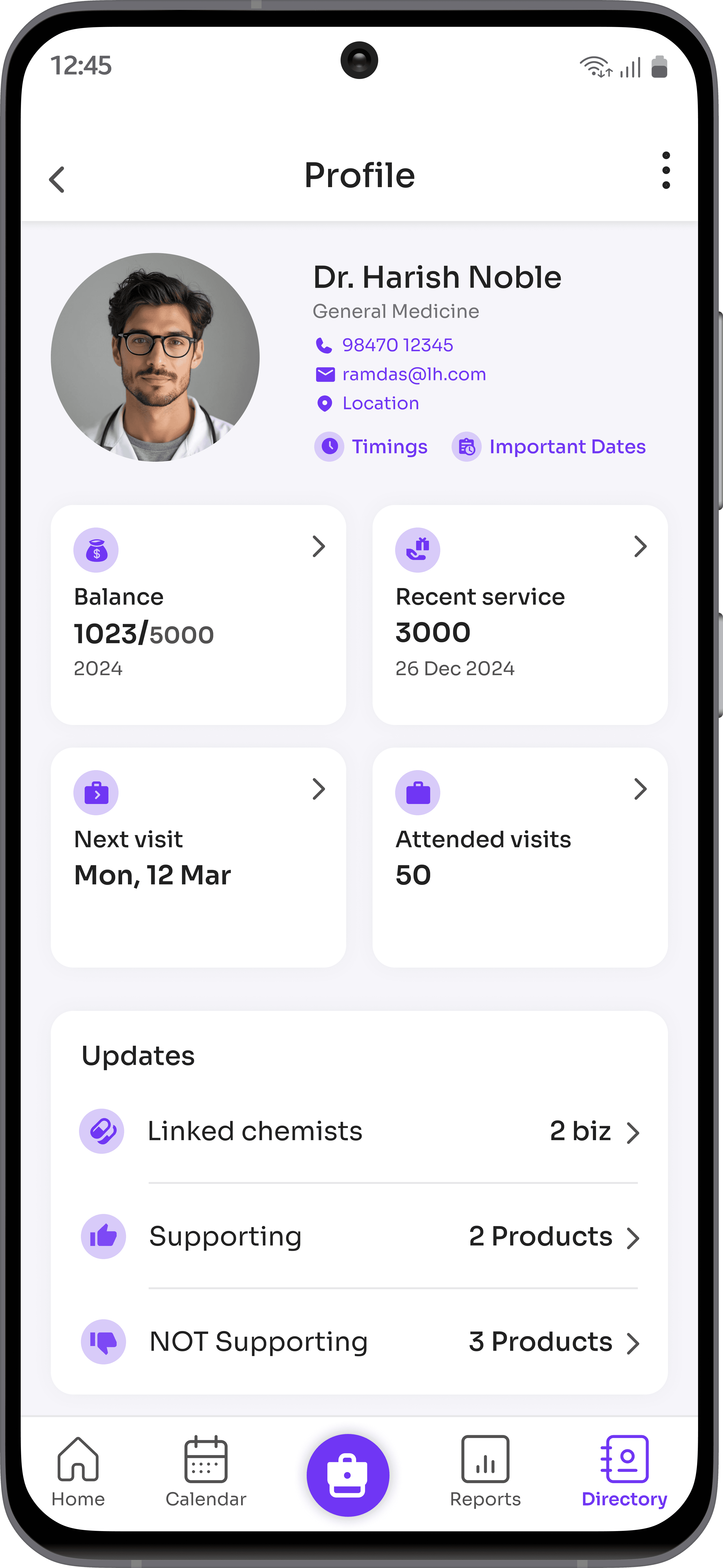
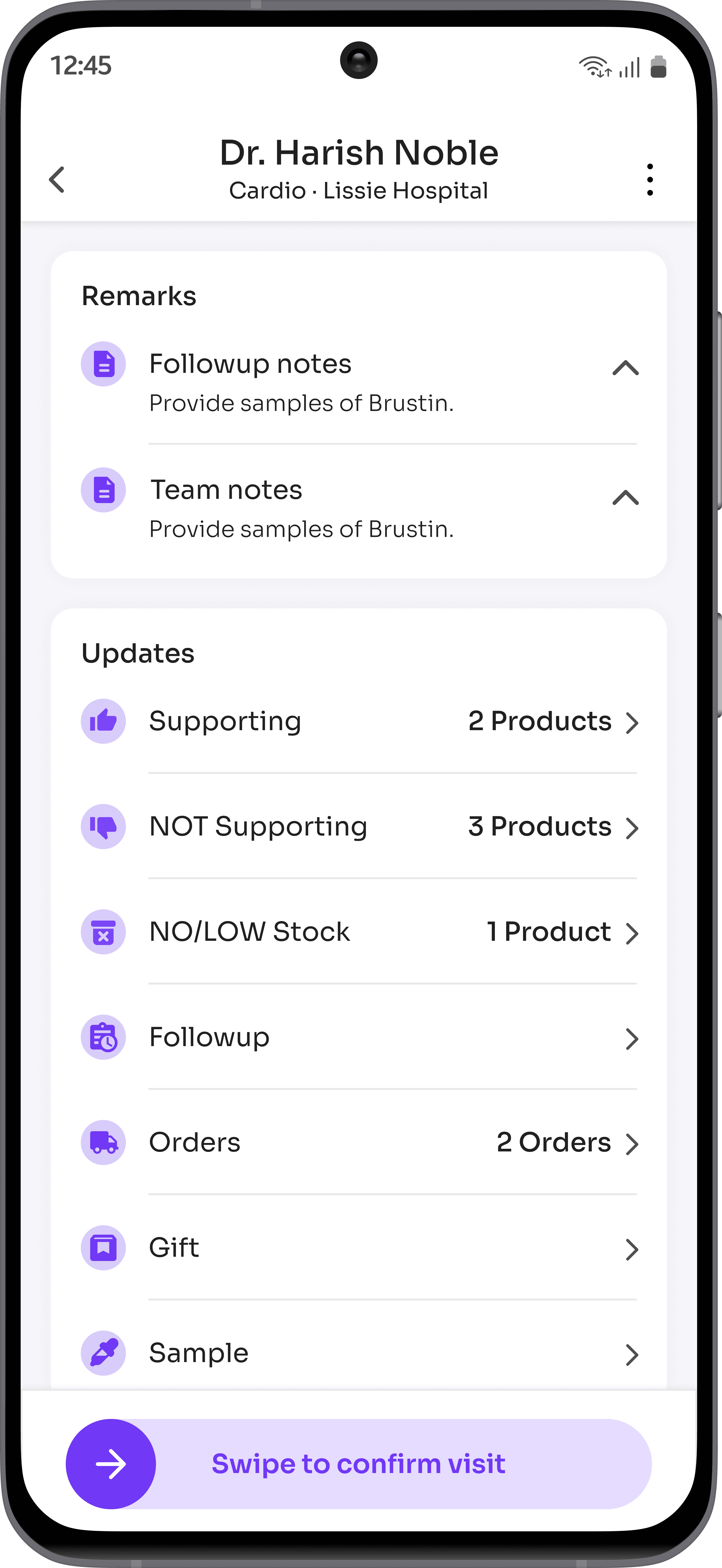
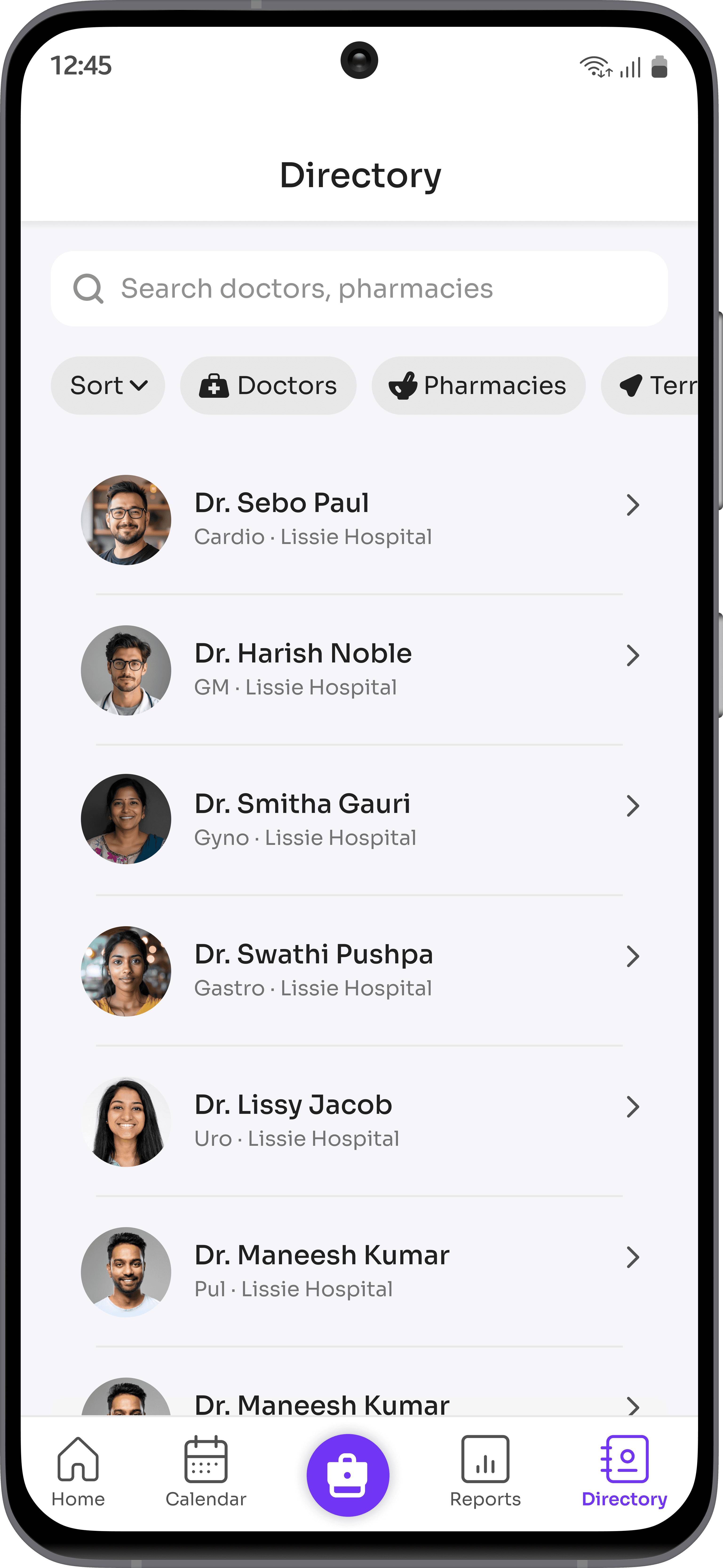
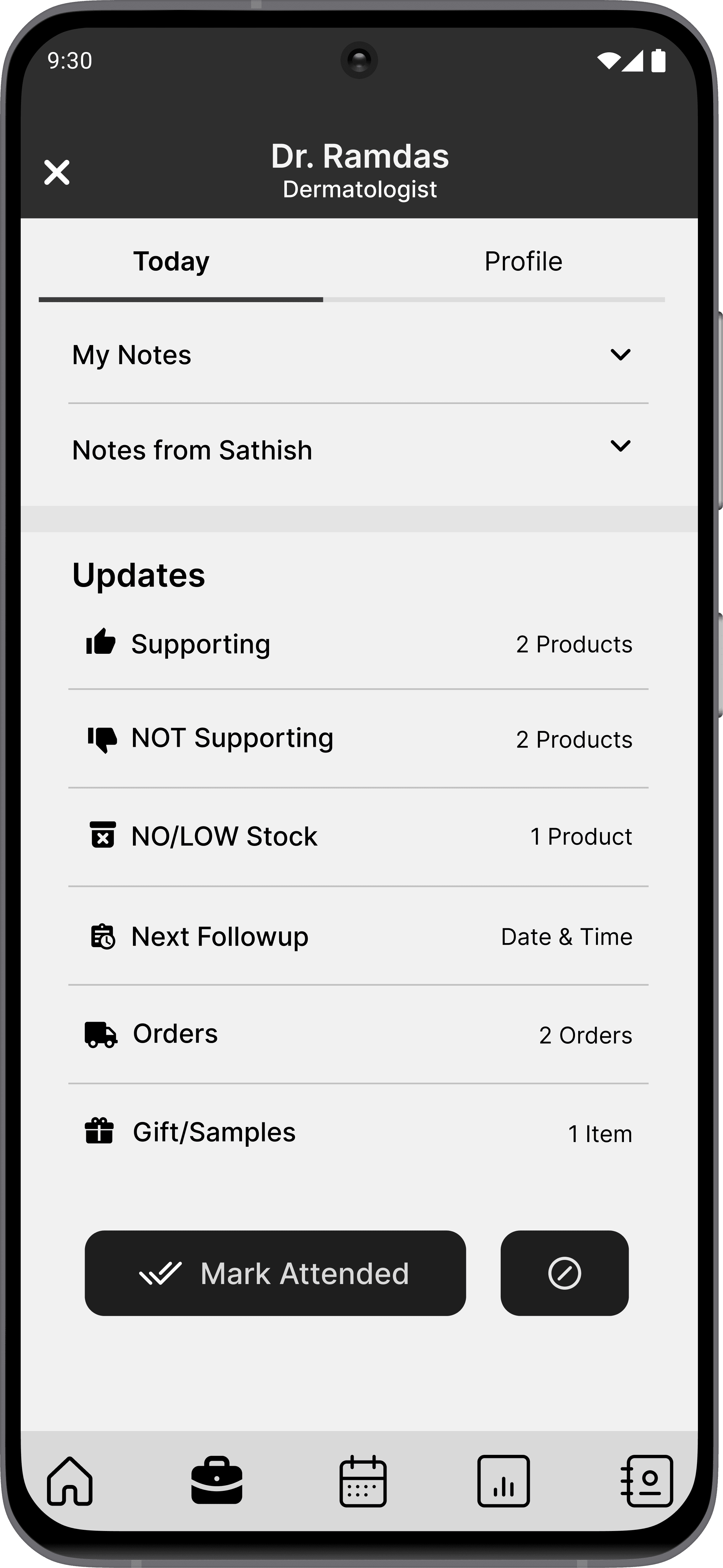
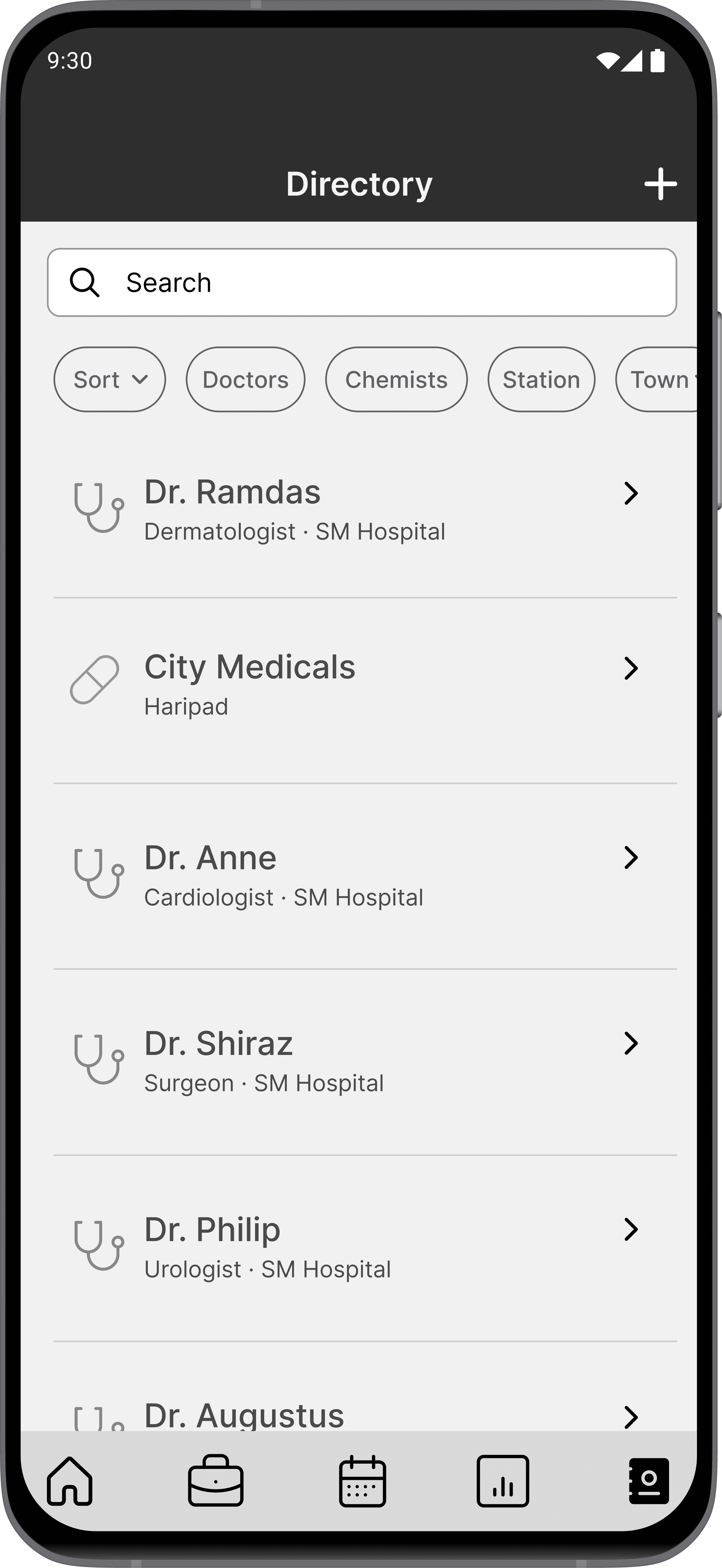
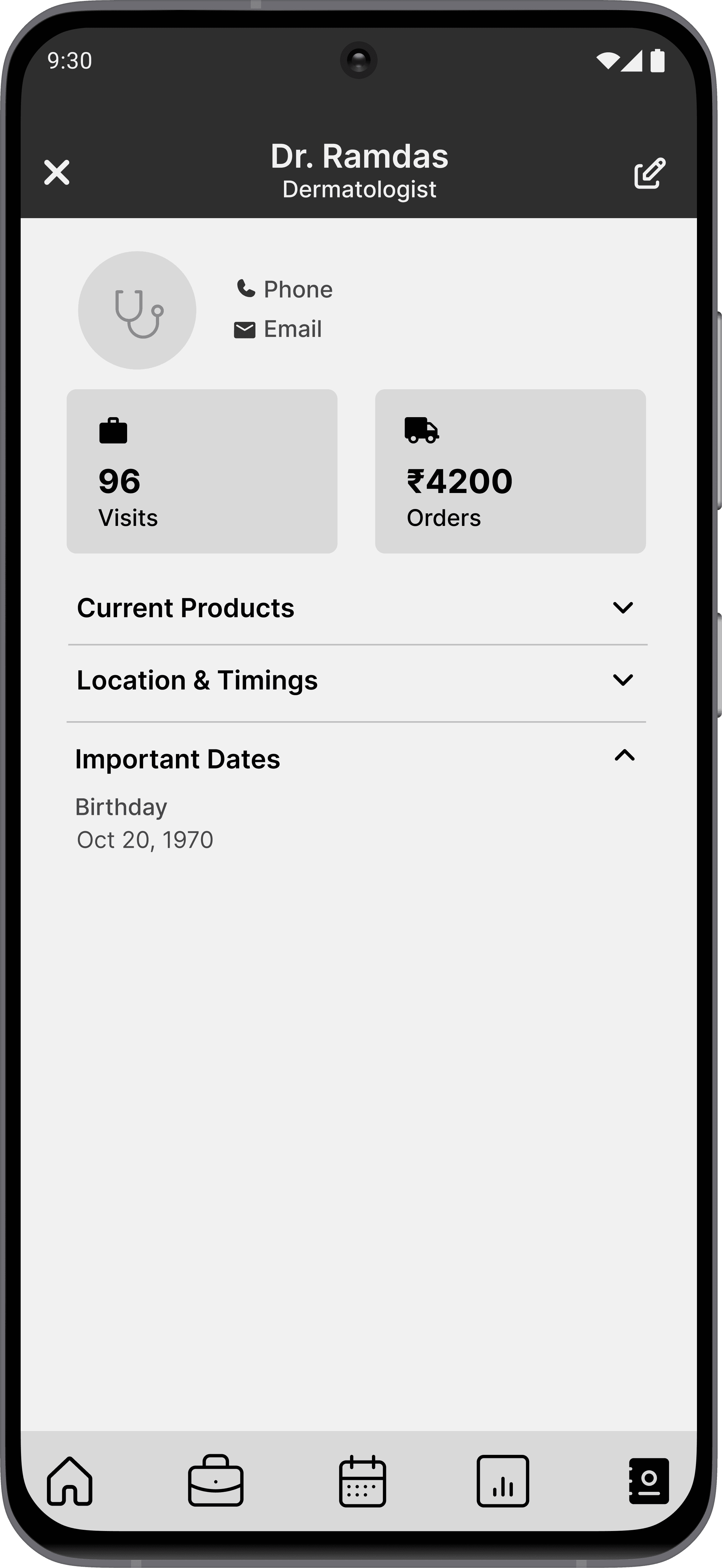
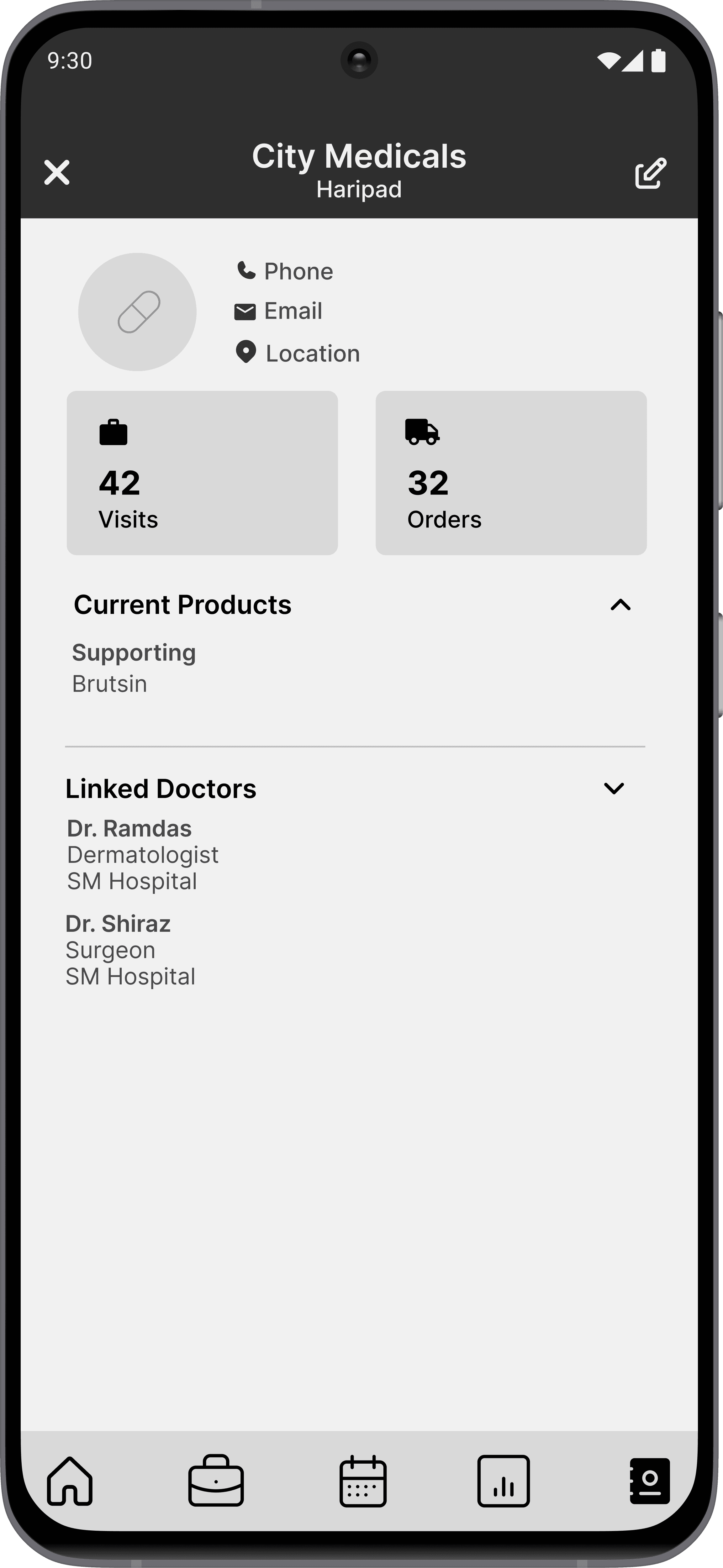
Profile: The client's profile serves as a convenient way to stay updated on their status and related information.
Advanced filtering: Advanced filtering has been introduced to provide easier access to client information.
7.4 Directory screen highlights
USABILITY TESTING AND REVIEW
The lo-fi designs were assessed.
Ensuring that the solutions align with the established objectives.
The lo-fi functional designs were created to address key issues and assess usability before transitioning to the UI design.
Five test scenarios were tested against twenty executives.
Five different testing scenarios were assigned to twenty random executives during a remote usability test. The sessions were recorded for detailed review to gather insights and ensure the effectiveness of the design.
The key issues identified were:
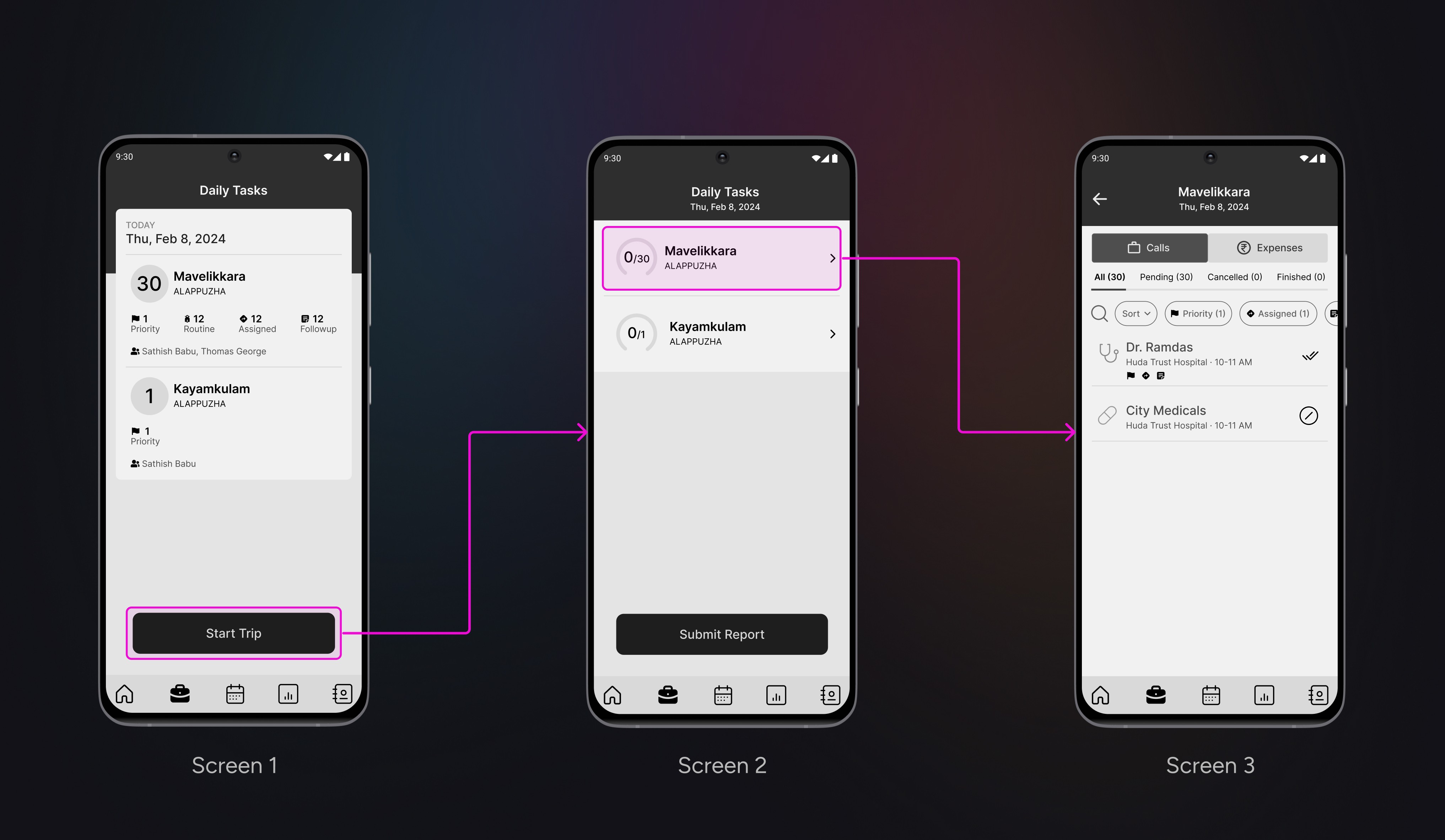
1. Redundancy in daily task flow
8.0 Daily task flow
Where:
The executives expressed confusion with Screen 1 and Screen 2 (as shown in 8.0 image).
What:
Upon clicking "Start Trip" in Screen 1 (as shown in the 8.0 image), the executive is presented with an overview of the tasks to be completed. However, after navigating to Screen 2, the details of the subtasks are not available, leaving the executive with no option to return to Screen 1. This lack of access causes frustration, as the executive struggles to effectively plan and track work progress based on the limited information provided in Screen 2.
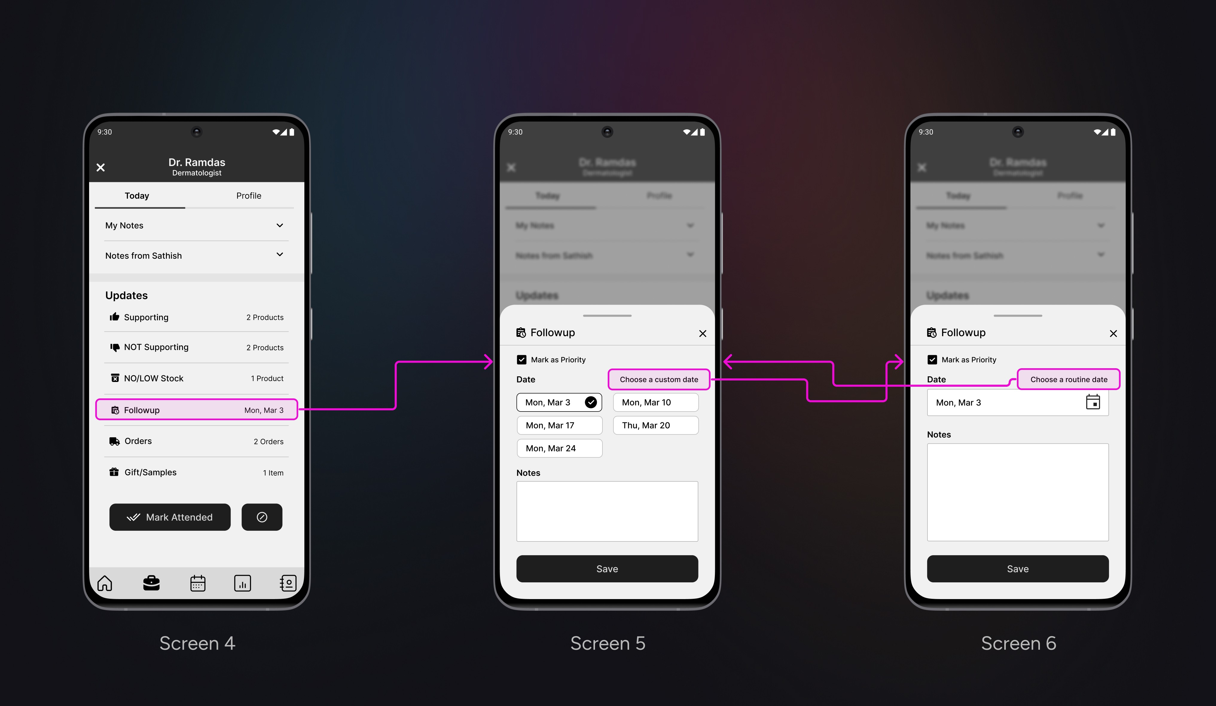
2. Followup flow confusion
8.1 Followup flow
Where:
The executives were overwhelmed by the numerous options displayed on screens 5 and 6 (as shown in 8.1 image).
What:
Upon clicking the follow-up date in Screen 4 (as shown in 8.1 image), a follow-up bottom sheet (Screen 5) appears. The executives seemed confused by the number of options displayed on both Screens 5 and 6, taking some time to make sense of the information presented.
FINAL DESIGN
Connecting the dots.
Revitalizing and aligning designs.
After a careful review of the insights gained from the usability tests and subsequent discussions with the team and management, we started the process of recreating the screens.
The major design changes were:
1. Daily task flow
9.0 Daily task flow - before and after
Rationale for the redesign:
Based on the feedback, the daily task initiation screen (Screen 11) included all the essential details that were unavailable on Screen 8, which are required for planning and tracking overall progress. Additionally, an extra screen (Screen 8) was eliminated as a result of removing the redundant "Start Trip" button, and the "Submit Report" button was moved to the "Reports" menu item.
2. Followup flow
9.1 Followup flow - before and after
Rationale for the redesign:
The overwhelming screens (Screens 15 and 16) have been redesigned (Screens 18 and 19) to provide clearer options and reduce cognitive load by introducing a tabbed button interface.
3. Doctor profile
9.2 Doctor profile - before and after
Rationale for the redesign:
Based on feedback from management, the doctor profile (Screen 20) was redesigned to accommodate more relevant information required by the executives. The redesign (Screen 21) was created in such a way that all necessary information can be deciphered at a glance.
TAKEAWAYS
What I learned.
Embrace ambiguity as a blessing
The absence of a clear direction encouraged me to think creatively and explore expansive ideas, resulting in enjoyable and unforeseen solutions.
The power of whiteboards
Being in the same physical space and watching shared ideas come to life visually has resulted in some of the most productive discussions I've ever experienced
