Virtual Queuing Management System
City of Toronto · Personal Project · 2023
AUTHOR CONDUCTED
User Research, Experience Design
TYPE
Digital kiosk and associated systems
STUDY CONDUCTED ON
2023 (July - August)
OVERVIEW
The City of Toronto has established accessible public service counters, particularly in civic centres across the city. These counters offer a variety of services, including information retrieval, fine payments, and ticket dispute resolution for the public. While online alternatives are available, these physical counters are primarily designed to assist individuals who face challenges with online services or have specific accessibility needs.
This study focuses on addressing the usability issues of the existing Virtual Queue Management System (VQMS) that utilizes a digital kiosk at public service counters. The research-based suggestions aim to enhance user-friendliness and functionality.
CONTEXT
TTC launched a larger passenger info display.
The display must remain relevant and useful to commuters.
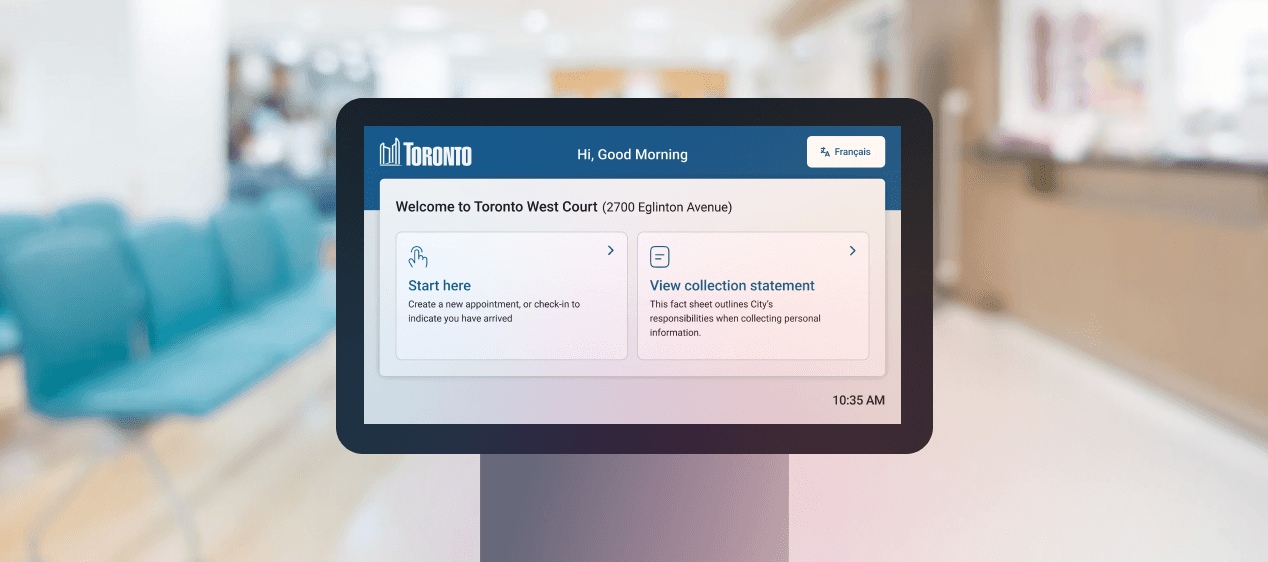
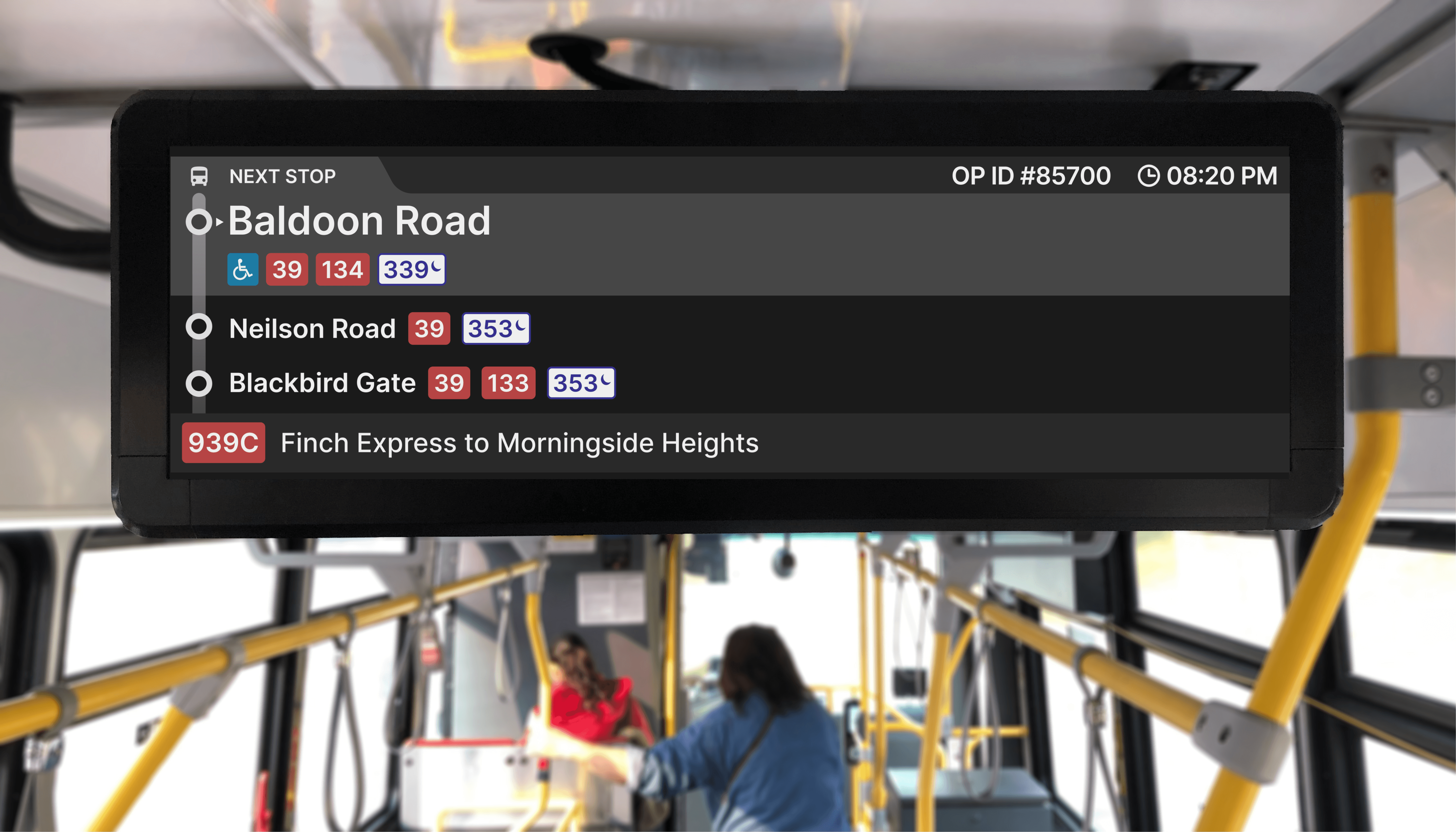
The city's existing Virtual Queue Management System (VQMS) consists of three essential user touchpoints: digital kiosk (as shown in 1.0 image), paper tickets printed by the kiosks, and information displays that show ticket numbers with audio announcements. Upon arrival, individuals with appointments can check in at the kiosks using the phone number provided at the time of their appointment. Walk-ins without appointments can also use these kiosks to print a ticket and join the virtual queue.
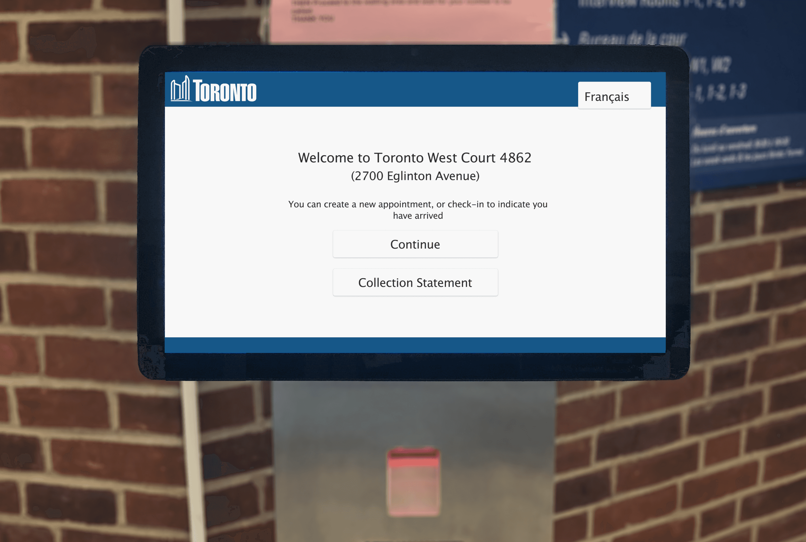
1.0 The existing passenger info display (PID)
Understanding the usability issues by travelling with and interviewing commuters.
Usability issues with the existing Virtual Queue Management System (VQMS) were identified through field studies conducted at Metro Hall and York Civic Centre.
FINDINGS / SUGGESTIONS
01
Information in PID is more than just data for commuters.
For commuters, the information presented in the PID is more than just data; it's a guide that helps them make informed decisions. Based on interactions with commuters, the way the information is presented is adversely affecting their ability to decipher it, and certain information can be added or omitted to provide more value to riders.
2.0 The existing passenger info display (PID)
Commuters struggle to stay attentive to the header text because each piece of information is visible for only about 5 seconds before switching to reveal the next.
As the header text continues to swap continuously, it becomes difficult to decipher the information without being patient.
Commuters suggested that the short intervals between stops made the time estimates shown in the PID less meaningful. Instead, they proposed using this space to provide valuable information, such as details about accessible stop facilities and transfer options.
2.1 Existing and Redesigned Screens
Provide commuters with standout, relevant information by leveraging the 'Von Restorff effect,' and improve visual hierarchy using 'Gestalt' principles for enhanced comprehension.
Replace stop ETAs with more pertinent information, such as transfer options and accessible stop facilities.
02
Cognitive dissonance in the stop request feature.
Ideally, the stop request feature promptly notifies the commuter about the upcoming stop, informs the operator, and provides feedback when the stop button is pressed. However, with the PID, commuters are experiencing feedback issues, which is causing confusion.
3.0 The existing stop request animation
There is a delay in visual feedback after pressing the request stop button, which results in cognitive dissonance.
The frequent swapping of the stop request prompt in the header causes uncertainty among commuters.
3.1 The redesigned stop request animation
Implement prominent static visual cues to ensure continuous visibility of stop request confirmations.
Incorporate subtle motion transitions to enhance noticeability and reduce cognitive effort, in line with the principle that 'motion attracts attention.'
03
More value per pixel.
There is untapped potential in utilizing the extra screen space available in PIDs. The integration of service alerts would further enhance the commuting experience and provide more value per pixel.
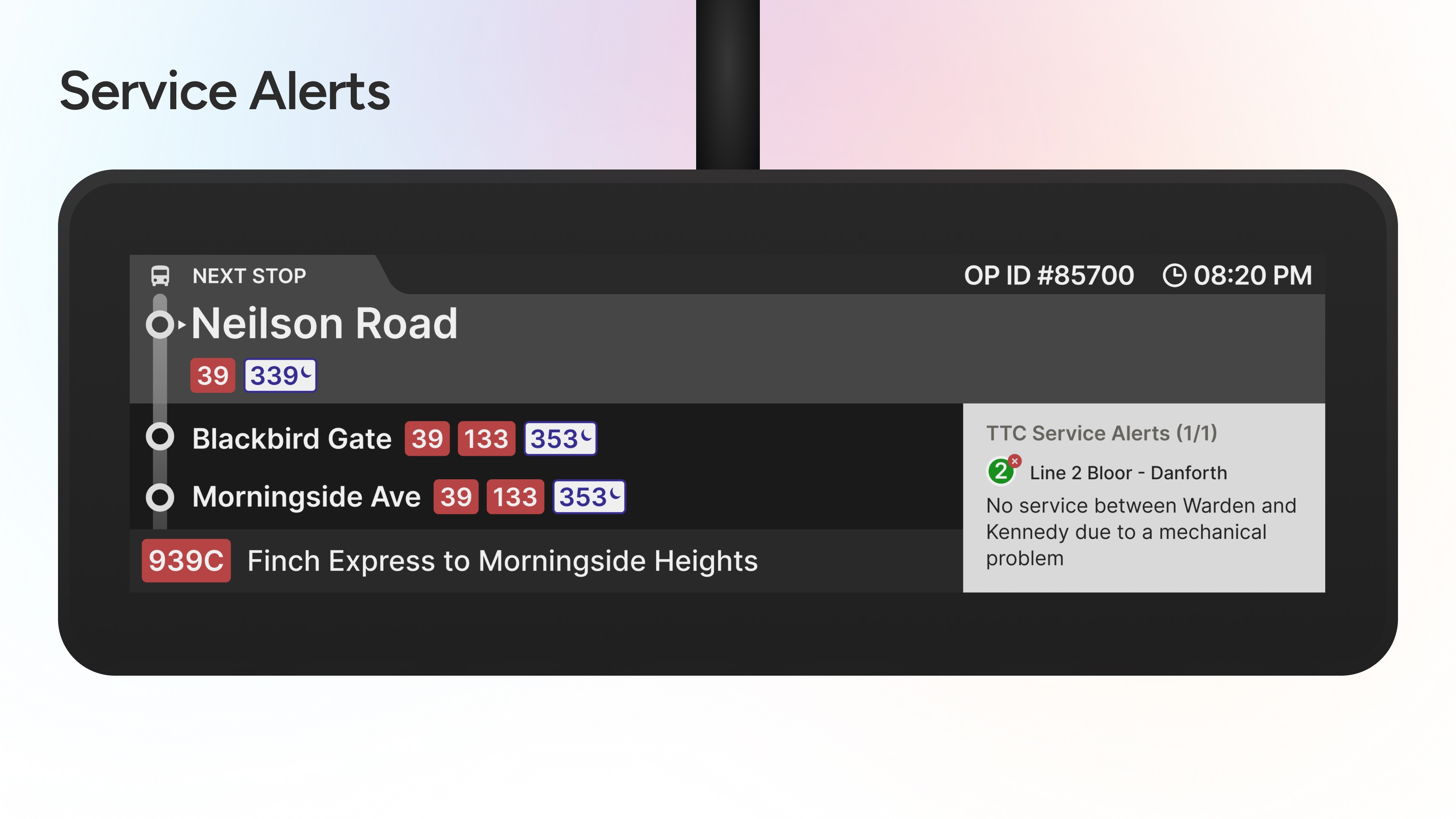
4.0 Service alerts included in PID
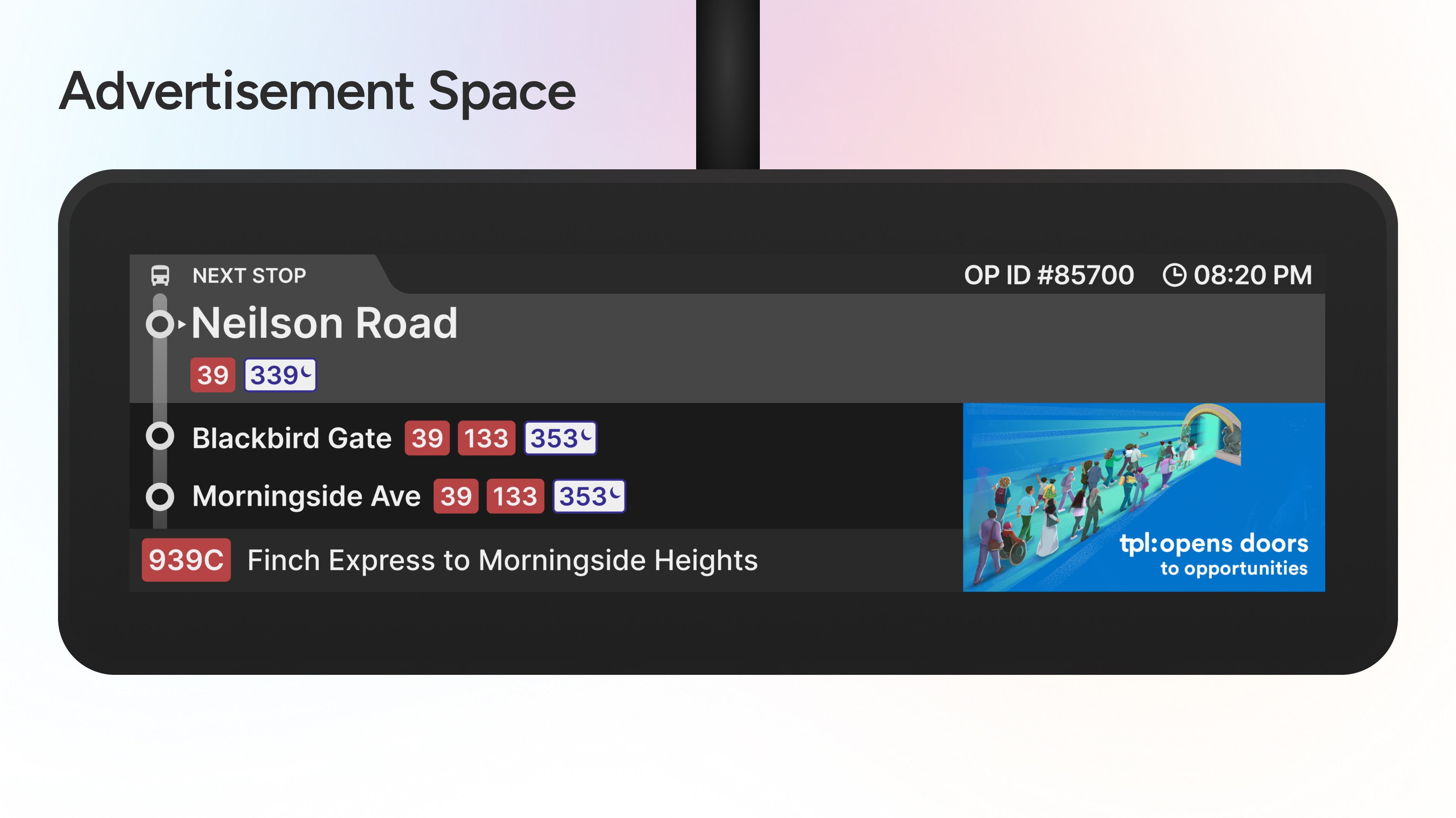
4.1 Adverts included in PID
Displaying service alerts can prepare passengers for potential changes in their travel plans. This mental readiness helps them adjust their expectations and plan their journeys more effectively, ultimately leading to a smoother transit experience
The surplus space on the information display can also serve as a platform for advertising, creating an additional revenue stream. By offering this space to businesses, public transit agencies can secure supplementary funds to enhance the quality and reliability of services for commuters. This approach not only supports a better transit experience but also generates a 'snowball effect' by improving overall services
OUTRO
A win-win situation for everyone.
Improving the PID can yield far-reaching benefits. A well-designed PID enhances the commuter experience, making public transit more appealing and convenient, which can lead to increased ridership and a shift from private vehicles, ultimately reducing carbon emissions. Additionally, an efficient public transit system attracts businesses and fosters economic development while promoting equitable mobility for all members of the community. This ensures that everyone can access information effectively, advancing inclusivity. These positive outcomes create a virtuous cycle that reinforces the importance of public transportation as a key driver of community well-being and environmental sustainability.
Apart from user research, web articles from various sources were used in this study.
OTHER WORKS

GET IN TOUCH