
Virtual Queuing Management System

This case study focuses on addressing the usability issues of the existing Virtual Queue Management System (VQMS) at City of Toronto Service Counters and providing research-backed suggestions to enhance user-friendliness and functionality.
This case study focuses on addressing the usability issues of the existing Virtual Queue Management System (VQMS) at City of Toronto Service Counters and providing research-backed suggestions to enhance user-friendliness and functionality.
AUTHOR CONDUCTED
Research, UX, UI Design
PLATFORM
Kiosk UI, Info Display UI & Print
PERIOD
2023 (July - August)
THE PROBLEM CONTEXT
The City of Toronto has established accessible public service counters, including those in civic centres across the city. These counters offer various services such as information retrieval, fine payments, and ticket dispute resolution. While online alternatives are available, these physical counters primarily cater to individuals facing difficulties with online services or specific accessibility needs.
To access services at these counters, individuals can either call a designated phone line or visit the online portal to schedule an appointment. Additionally, some centres accommodate walk-ins for added convenience. Upon arrival, individuals with appointments can check-in using the provided kiosks. Those walking in without appointments can also use these kiosks to print a ticket and join a virtual queue.
The city's existing Virtual Queue Management System(VQMS) comprises three essential user touchpoints: digital kiosks, tickets printed by the kiosks, and information displays that show and announce ticket numbers. This case study delves into these touchpoints addressing a subset of the problems uncovered during the research, proposing enhancements to improve the overall experience, all grounded in established psychological principles.
The Existing Kiosk at one of the Service Counters
THE RESEARCH
Usability issues with the existing Virtual Queue Management System (VQMS) were identified through field studies conducted at Metro Hall, York Civic Centre, and contextual inquiries involving 11 participants.
THE CASE STUDY
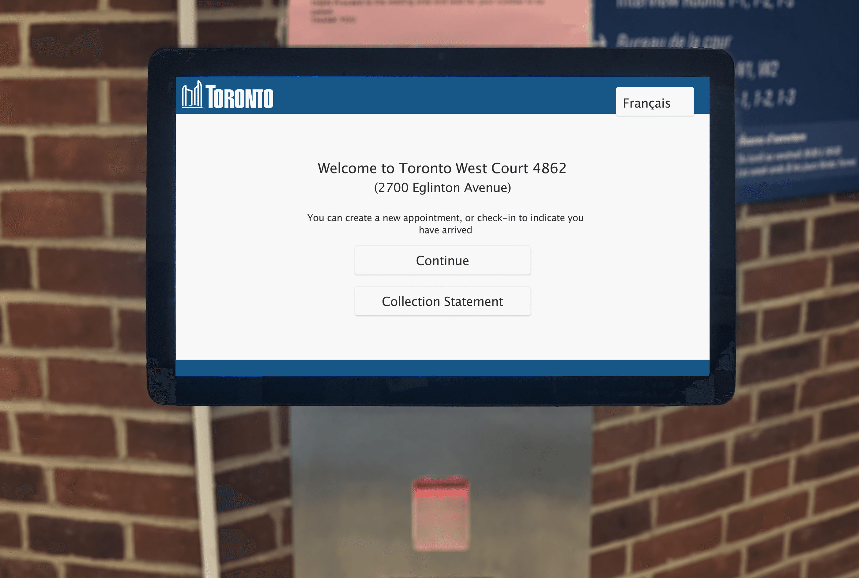
The Welcome Screen
KIOSK
The welcome screen of the kiosk serves as the critical point of initial contact between users and the VQMS, marking the outset of their journey. This initial encounter is pivotal, as it lays the foundation for the user's overall experience and forms their first impressions.
Comparison of Existing and Redesigned Welcome Screens
Based on the research conducted the notable usability issues related to the existing welcome screen are:
Unclear Focus: One significant issue is the lack of a clear and informed indication of the actions on the home screen.
Navigational Hurdles: Another issue revolves around the limited touch areas and the absence of visual cues, which collectively make navigation a cumbersome task.
To address these issues effectively, clear objectives for the redesigning the welcome screen were set:
Empower with Information: Provide users with comprehensive information using 'Visual Hierarchy' to prominently display critical details, helping them make informed decisions.
Facilitate Navigation: Introduce visual cues to ease navigation and ensure users quickly understand their options by applying the 'Fitt's Law' and 'Recognition' principles.
Reduce Cognitive Load: Minimize cognitive load by organizing content logically and making elements more user-friendly using 'Recognition' principles.
Furthermore, the 'Personalization' principle was seamlessly integrated to create a tailored and positive user experience, further elevating the welcome screen's effectiveness.
🧠
PSYCHOLOGY INSIGHTS
Personalization
"Hi, Good Morning" on the kiosk welcome screen can improve the user experience based on the personalization principle by creating a sense of warmth and familiarity. By using a friendly and personalized greeting, the digital kiosk can establish a more human-like interaction, making users feel welcome and valued. This simple act of personalization can enhance the overall user experience and encourage users to engage more willingly with the kiosk's services.
Recognition
The recognition principle suggests that using familiar and easily recognizable symbols or icons can improve user understanding and interaction with a system. By using familiar symbols to represent functions and actions, icons provide visual clarity and faster comprehension. Their language independence makes them universally understandable, catering to users of diverse backgrounds.
Fitt's Law
The law states that bigger targets are easier and quicker to select. Implementing larger buttons reduces errors, enhances accessibility, and creates a smoother interaction, leading to a more satisfying user experience overall.
Visual Hierarchy
Through logical content organization, the establishment of a visual flow, and improved scannability, visual hierarchy ensures that users can promptly spot crucial elements and minimize cognitive load. This leads to a user-friendly experience, allowing users to navigate the welcome screen effortlessly and ultimately enhancing efficiency and user satisfaction.
The Menu Screen
KIOSK
The menu screen follows the welcome screen, serving a crucial purpose by providing users with options for the services they are seeking, which is precisely why they use the kiosk. This underscores the significance of the menu screen and its pivotal role in guiding users through the array of choices available.
Comparison of Existing and Redesigned Menu Screens
The existing menu screen presents a set of significant challenges that impact the user experience:
Information Overload: There is an excess of text without any visual cues on the screen, which makes it difficult for users to comprehend the content.
Decision Fatigue: Users are confronted with an overwhelming number of options, leading to frustration and delays in decision-making.
To address these challenges, the menu screen redesign objectives were strategically defined:
Streamline Decision-Making: Utilize 'Visual Cues and 'Signifiers' to guide users, reducing cognitive load. Employ the 'Law of Common Region' to group related options for improved comprehension.
Organize Options: Follow 'Hick's Law,' logically cluster menu options, in alignment with the 'Law of Common Region', simplify the user experience and expedite decision-making.
🧠
PSYCHOLOGY INSIGHTS
Signifiers
Signifiers provide clear direction, guiding users to the intended actions and reducing cognitive load. With faster decision-making and improved accessibility, users feel more in control and confident while navigating the interface. Consistent use of signifier arrows enhances learnability and overall usability, making the interaction with the kiosk more intuitive and enjoyable.
Law of Common Region
By visually grouping related options within clear boundaries or sections, users can quickly navigate the menu and identify choices of interest. This grouping reduces cognitive load, improves scannability, and facilitates decision-making. Users can form mental associations more easily, streamlining the selection process. Whether through categorization or a hierarchical structure, applying this principle helps transform a complex menu into an organized and user-friendly interface, ultimately easing the cognitive burden on users.
Hick's Law
By limiting the number of choices in the buttons, decision-making time is reduced, allowing users to quickly and efficiently select their desired actions. The streamlined navigation, based on the frequency of use or relevance, makes it easier for users to find essential functions. This logical arrangement minimizes cognitive load, reducing user overwhelm and increasing overall satisfaction.
The Closing Screen
KIOSK
After selecting a service, the user is directed to the closing screen while the paper ticket is being printed. This screen holds immense importance as it marks the conclusion of a user's interaction. It serves as a crucial bridge to guide users toward the next steps.
Comparison of Existing and Redesigned Closing Screens
Drawing from the research, specific opportunities to enhance usability on the closing screen were identified:
Process Clarity: It's crucial to ensure users are well-informed about the next steps, especially in the context of lengthy processes.
Guided Reassurance: Providing users with clear information on how they'll be notified of their turn adds a reassuring element to their experience.
In line with these insights, the objectives for the redesigning the closing screen were established:
Inform Users About Next Steps: Leverage the 'Priming Effect' principle, the goal is to convey subsequent actions clearly and provide users with a sense of what to expect.
Enhance Engagement: Implement 'Contextual Guidance' to create a more engaging and satisfying experience. This involves making users aware of how they will be notified about their turn, adding a reassuring touch to the interaction.
🧠
PSYCHOLOGY INSIGHTS
Priming Effect
Priming involves exposing users to relevant information beforehand, which can influence their subsequent actions and decision-making. By priming users with clear and concise instructions about what to expect next in the process, the digital kiosk prepares users mentally for the upcoming steps. This reduces uncertainty and anxiety, creating a more seamless and confident user experience.
Contextual Guidance
By offering relevant and timely instructions based on the user's current context and actions, contextual guidance provides appropriate information to guide and assist users. This proactive assistance eliminates guesswork and reduces user frustration.
The Paper with Ticket Number
THE TICKET
After interacting with the kiosk, a ticket is printed based on the service the user wants to avail. The information on this ticket plays a pivotal role in the user's journey, especially when it comes to recognizing when their turn has arrived at one of the service counters.
Comparison of Existing and Redesigned Printed Tickets
The existing printed ticket layout presents a set of significant problems that affect the way the users interpret information:
Character Confusion: Users often misinterpret ticket numbers due to the presence of similar characters (e.g., confusing '0' with 'O', '1' with 'I'). This leads to errors in recognizing their turn.
Information Overload: Deciphering the ticket number amidst a sea of other information on the screen can be challenging, resulting in user confusion.
To address these challenges, the objectives for the redesigning ticket layout were formulated:
Mitigate Confirmation Bias: Use of distinct alphabets (e.g., 'M' and 'E') to reduce misinterpretation, combating confirmation bias.
Enhance Visibility: Employ 'Von Restorff Effect,' so that the ticket numbers stand out with a contrasting background.
Simplify Layout: Apply 'Gestalt Principle', and streamline the 'Visual Hierarchy' for quick and error-resistant ticket number recognition.
🧠
PSYCHOLOGY INSIGHTS
Confirmation Bias
When users see a number that resembles their ticket number, they may immediately assume it is theirs due to confirmation bias. This cognitive bias leads users to seek information that confirms their pre-existing beliefs or expectations, even when the information may be ambiguous or misleading. As a result, users may prematurely approach the counter, thinking it is their turn, leading to potential confusion and delays in the service process.
Von Restorff Effect
By highlighting the ticket number, it stands out prominently from the rest of the details on the ticket. This distinctiveness grabs the user's attention, making the ticket number more memorable and easier to find amidst the surrounding information. By leveraging the Von Restorff effect, users can quickly and accurately identify their ticket number, reducing confusion and frustration.
Gestalt Principle
Applying the Gestalt principle to the printed ticket can greatly improve scannability through effective visual hierarchy. Proximity ensures that related details like the ticket number, timestamp, and counter information are grouped closely, facilitating quick identification. Similarity in fonts, colors, and formatting for related information creates visual patterns for easy comprehension. Closure, achieved through enclosing sections with lines or boxes, guides the user's eye smoothly across the ticket's content.
Calling the Tickets
THE INFO DISPLAY
With a paper ticket in hand, the user eagerly anticipates their turn while keeping a close eye on the information display. Calling ticket numbers on the information display is a critical component of any queuing system, and grabbing the user's attention when a new number is called is essential for smooth operations. This moment marks the transition from waiting to active engagement, underscoring the importance of ensuring that users notice and respond promptly when their turn comes up.
Existing Info Display
Based on the research, areas of improvement have been identified for the existing info display:
Visual Cue Absence: A notable issue is the lack of visual cues to distinguish the currently called ticket number from previously called ones displayed on the screen.
User Frustration: Users often become frustrated when they struggle to identify the last called number, particularly when they lose track.
Redesigned Info Display
Based on the findings the objectives for redesigning the info display were:
Enhance Recognition: Employ 'Visual Cues' such as size and motion, along with the 'Von Restorff Effect', the newly called ticket number can be easily recognized and distinguished.
Organize Chronologically: For quick identification, arrange the ticket numbers chronologically. This approach simplifies the user experience and ensures that users can promptly spot their ticket when it's called, further improving usability.
🧠
PSYCHOLOGY INSIGHTS
Von Restroff Effect
The combination of visual and subtle animation elements enhances the Von Restorff effect, ensuring users can quickly and confidently identify their called ticket number.
Motion Attracts Attention
By applying dynamic effects such as blinking, or gently pulsating the called ticket number, it draws immediate attention and captivates users' focus. The movement and animation create a sense of urgency, prompting users to notice the called number amidst other static elements on the display.
THE OUTRO
In one of the locations, there is an instruction sheet positioned directly above the kiosk, offering guidance on its usage. However, this setup can negatively impact the user's experience as it requires them to shift their attention from the kiosk interface to read and understand the instructions, introducing an unnecessary cognitive load. More importantly, it raises questions about the intuitiveness of the kiosk since the need for an instruction sheet serves as evidence of potential usability issues.

The Instruction Sheet Displayed Above an Existing Kiosk
Improving the user experience in a queue management system at public offices or civic centers may not directly generate extra revenue. Still, it holds immense value in terms of enhancing customer satisfaction, boosting operational efficiency, increasing staff productivity, improving public image, promoting civic engagement, and facilitating efficient service delivery.

The Redesigned Kiosk UI of the Welcome Screen
These factors collectively contribute to an overall positive perception of the public office and foster a more constructive and productive relationship with the community it serves.
REFERENCES
▸ Abrams, R. A., & Christ, S. E. (2003). Motion onset captures attention. Psychological Science, 14(5), 427–432. https://doi.org/10.1111/1467-9280.01458
▸ Norman, D. (2013). The design of everyday things: Revised and Expanded Edition. Constellation
▸ Wikipedia contributors. (2023). List of cognitive biases. Wikipedia. https://en.wikipedia.org/wiki/List_of_cognitive_biases
▸ Tomboc, K. (2023, March 29). Gestalt design principles. UsabilityHub. https://usabilityhub.com/blog/gestalt-design-principles
▸ Priming - The Decision Lab. (n.d.). The Decision Lab. https://thedecisionlab.com/biases/priming
▸ Yablonski, J. (n.d.). Home | Laws of UX. Laws of UX. https://lawsofux.com/
OTHER WORKS

GET IN TOUCH
Have a question? Drop an email or connect via LinkedIn.
Say hi!
Copy Email

Have a question? Drop an email or connect via LinkedIn.
Say hi!
Copy Email